Full Moon Reduction Relief Print Cards

A photograph I took at a local lake inspired this image.

I am carving what will remain the color of the paper which is white. I am printing on Cougar Natural paper.

This is the key block for this image - and the fourth color which was black. The second and third colors were a variations of a mauve-gray.

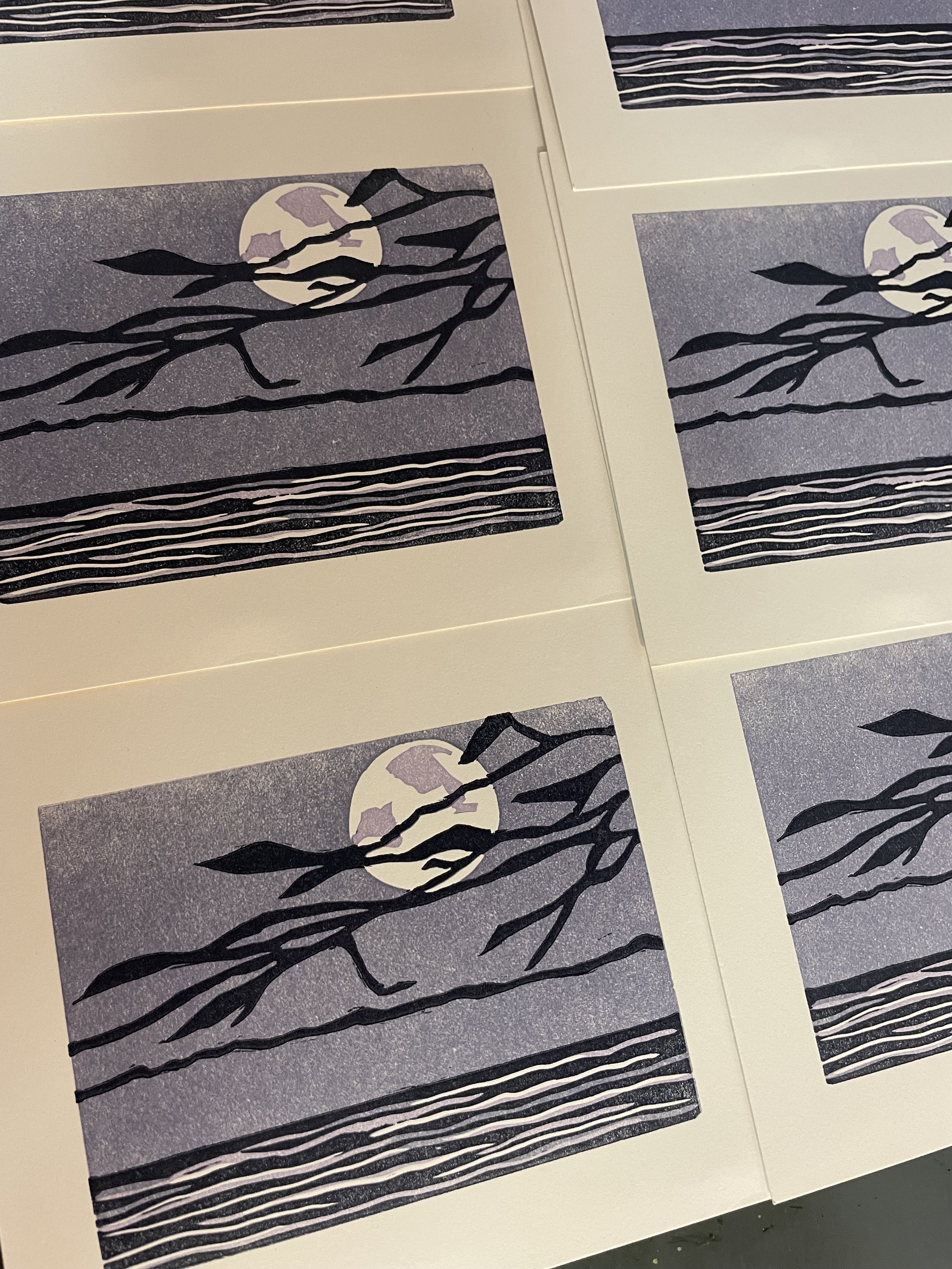
Printed cards using four color runs. Each time more of the block is carved away leading up to a completed image. Reduction relief prints are a fun way to explore color and image.

I enjoyed exploring color, image, and the theme of the full moon. Both of these cards are blank inside allowing for notes by the sender. I love making, sending, and receiving cards!

I recently created and printed two new cards using the reduction relief printing process. They were inspired by the full moon, a local lake, and our dog Max. Once I had designed each image; I worked on them at the same time enabling the same color scheme.


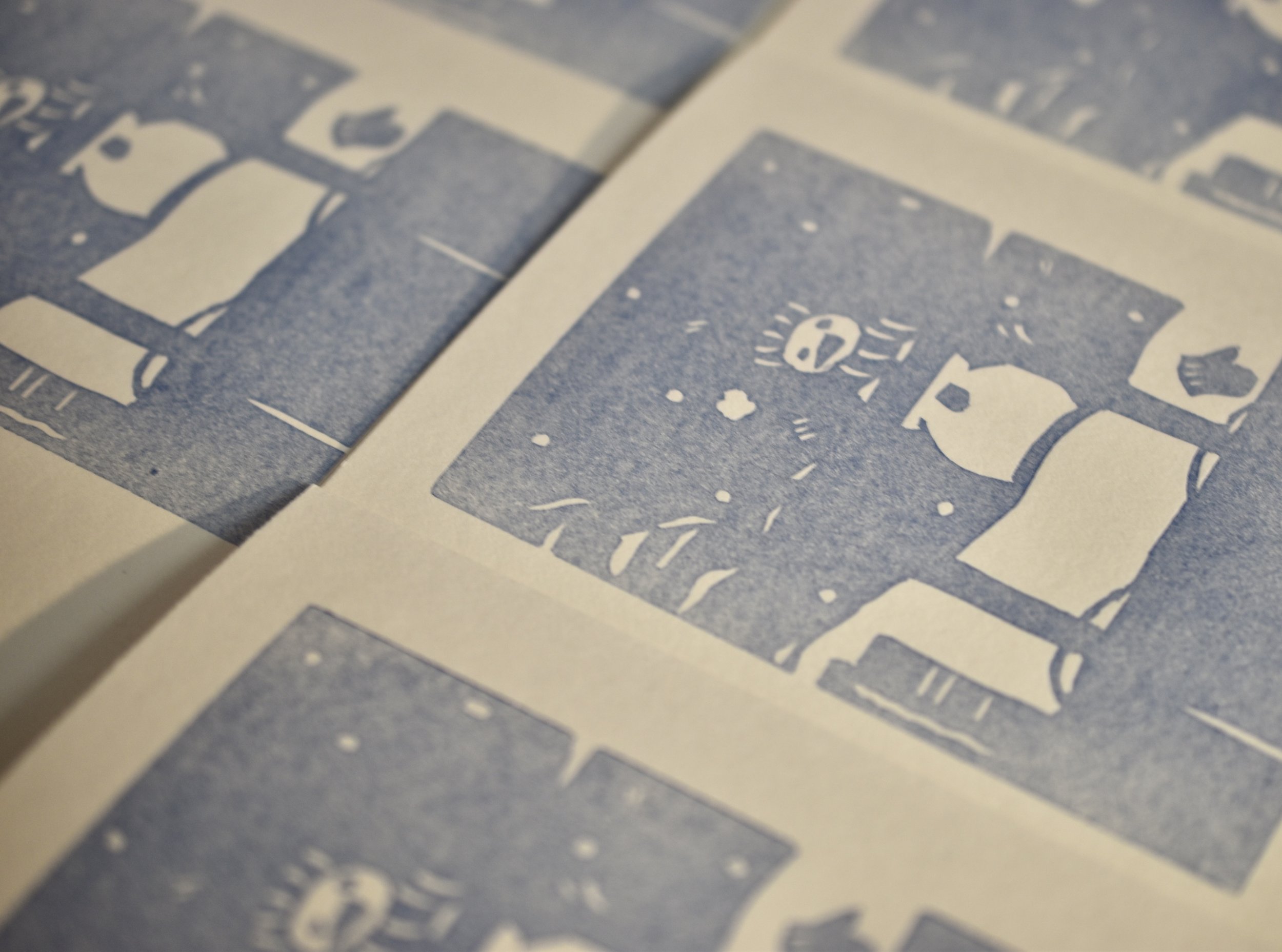
This image was inspired by our rescue dog Max. He would often howl when he heard sirens. He would stop if he thought anyone was watching. Every so often I was able to take a picture of him. He was a beautiful dog, full of energy.

These carved areas will remain the color of white Cougar natural paper.

This is the key block for this image. This also had two mauve-gray colors for the second and third color. The fourth and final printing was black.

Completed cards. It took four color runs to arrive at a satisfying image of Lake Townshend at night.

A Trio of Bird Prints - A Tribute to the GreenHill Center

I began by walking around the GreenHill with my camera. I walked, took pictures, sat and visually explored the area. It was a beautiful December afternoon. These are a few of the images I took and used when drawing and designing the prints.

Barred Owl

Crow

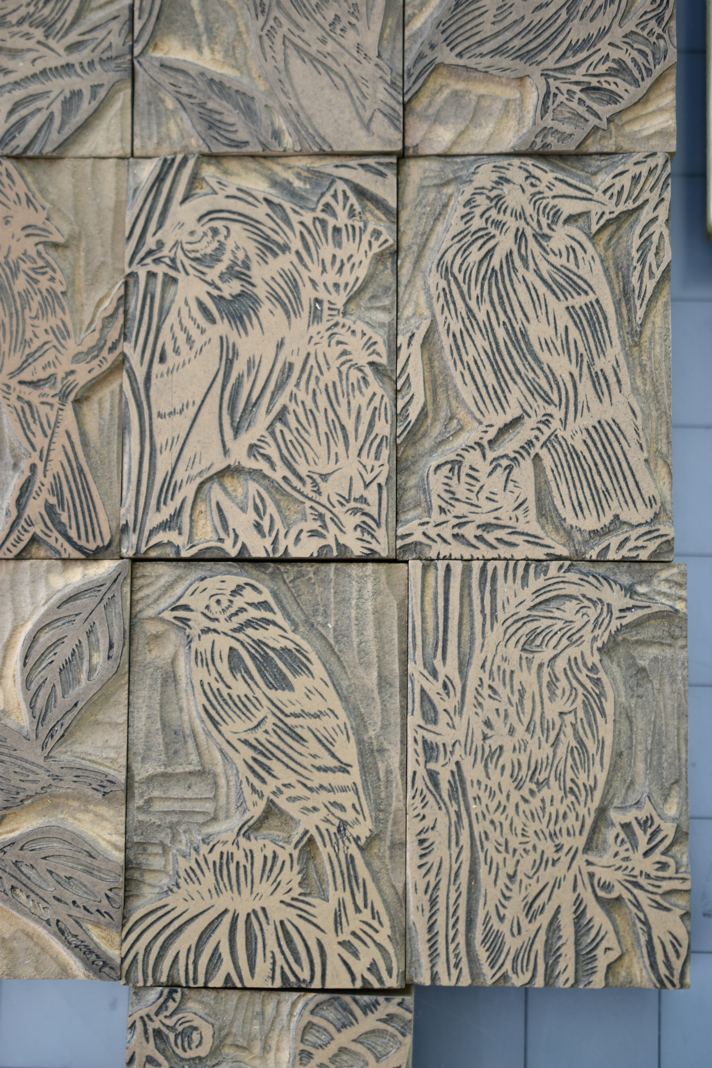
Each block took about 10-12 hours to carve. I took my time as each image had quite a bit of detail. The blocks measure 9”x12”.

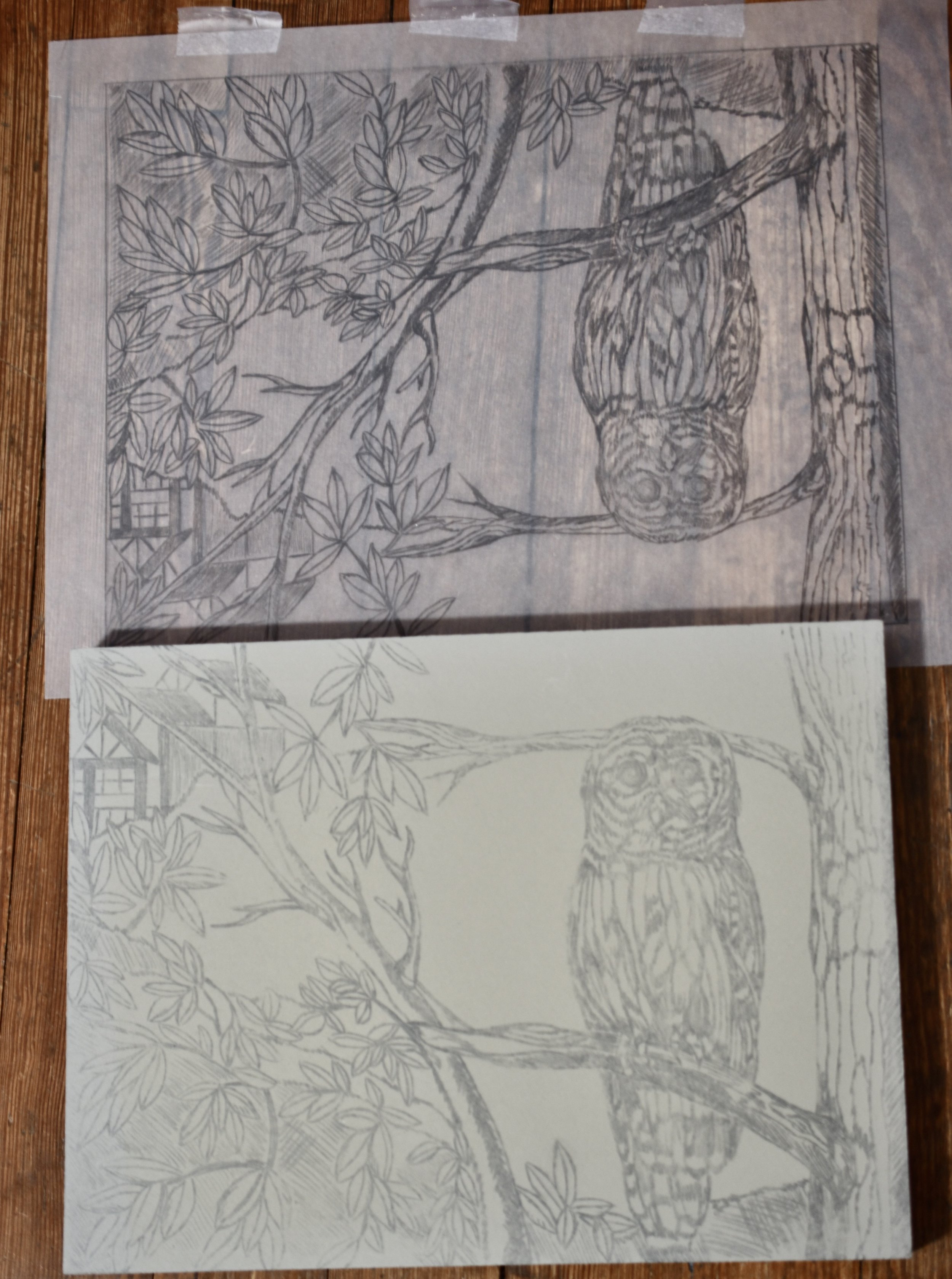
This picture shows what the owl print looked like after being traced and transferred; before I went over the traced image with the Sharpee pen.

The Barred Owl block locked up and ready to print!

I titled the crow print The Seeker.

This was a rewarding project. I am grateful to the GreenHill Center for inviting me to participate in their 50th Anniversary and for all their contributions to the arts community over the years.

I completed a suite of prints for the Anniversary Portfolio Boxes for the GreenHill Center. These boxes will be presented at the Anniversary Gala in May of 2024. This year marks the 50th Anniversary of the GreenHill. I was excited to be a part of this celebration. The GreenHill has meant a great deal to me as an artist and educator.

Carolina Wrens - I just had to have two of these sprites in the print!

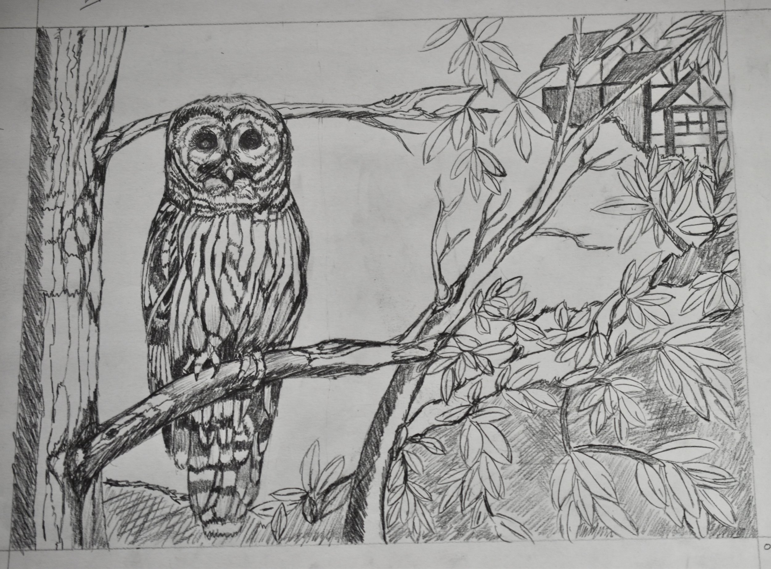
I knew from the start of this project that I wanted to use birds in the prints. I focused on birds that I have seen in my neighborhood (which is very close to the GreenHill). I chose the Barred Owl, Crow, and Carolina Wrens. I then began playing around with the use of space and imagery. This was loads of fun; particularly when I started using components of the Center in the background of the drawings. I wanted to bring the natural surroundings, birds, and architectural elements together in each drawing. Here are the three pencil drawings I used for the prints. I traced each drawing, transferred it to a block, and then drew over the transferred image with a Sharpee pen. This step helps with the carving process since it clearly defines the image.

I printed a mat using a blend of blue and teal for each print. This provided a richly colored ground for the prints, which I printed in black. It accentuated the foreground and background for the printed images. I used Stonehenge paper for the prints, which printed beautifully.

I titled this print The Watcher.

I titled the Carolina Wrens The Players. This print is my favorite. I am really pleased with the use of the space and the placement of the GreenHill. Though the berries took some time carving, they add a nice element to the surroundings of the wrens.

Reduction Prints - Barred Owl Nocturne and Sanibel Blue

I transferred Barred Owl Nocturne to the lino block after tracing the pencil sketch. I used a bone folder and rubbed the back of the traced drawing until it was thoroughly transferred.

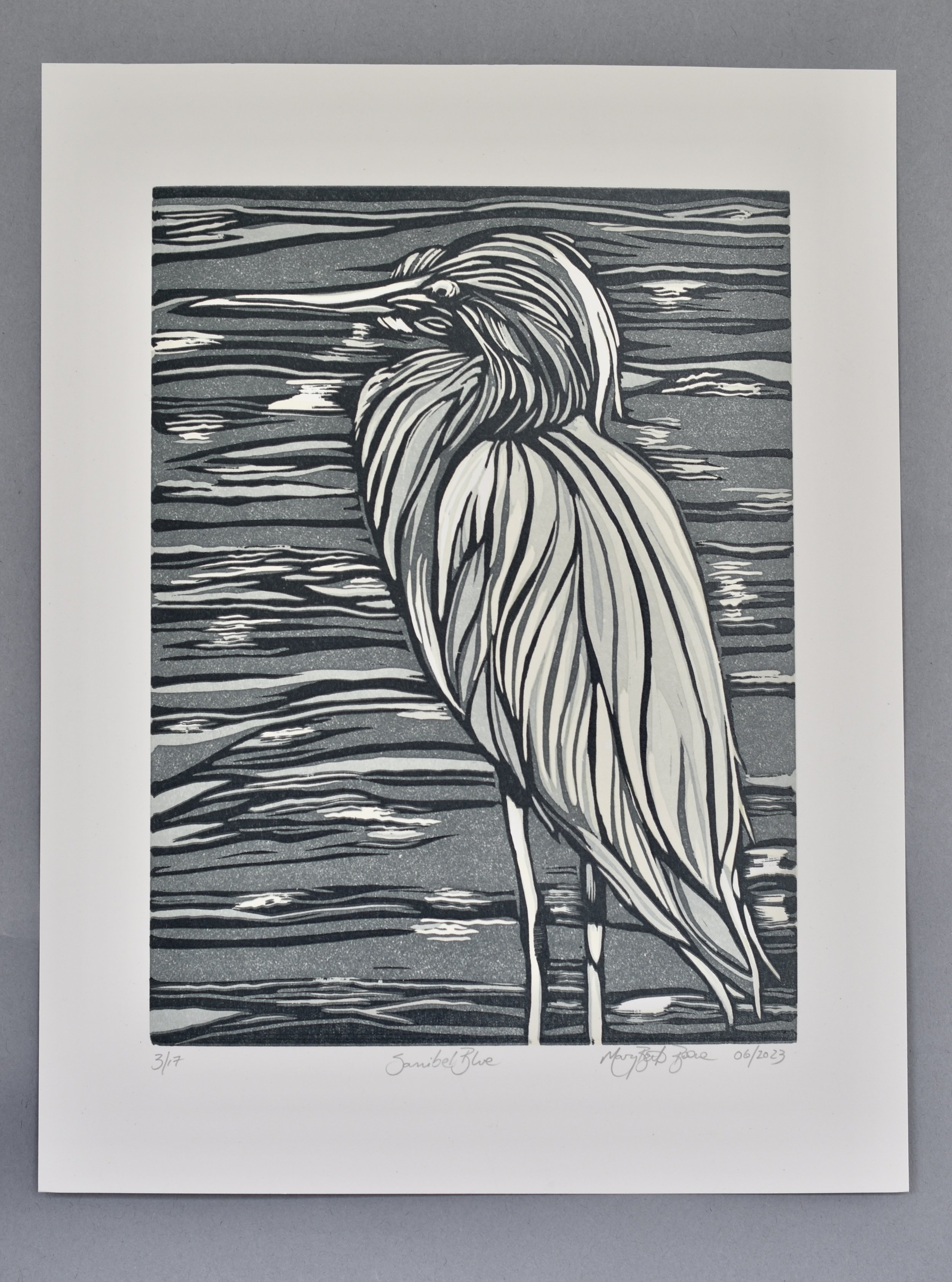
I am printing the first run of Sanibel Blue. All of the carved areas will remain the color of the Cougar Natural paper. The first color was a pale gray. This print was a six color run. When printing a one block reduction print, you start with the lightest color and end with the darkest color. Each color is printed on top of the previous color. The carved areas allow the image to develop as each color is printed. The final run is called the key block since it gives the final and all-important details of the image.

Ready to print the final run of Barred Owl Nocturne using the carved key block.

Print and key block on the press, Barred Owl Nocturne.

It is always satisfying to complete a reduction print. It is an arduous process, but an exciting way to print multi-colored prints using one block.

Barred Owl Nocturne

I continued exploring reduction relief printing this year. Barred Owl Nocturne and Sanibel Blue were challenging and rewarding endeavors. Take a look at the steps I took to complete these two prints.

The fully transferred image is ready to carve.

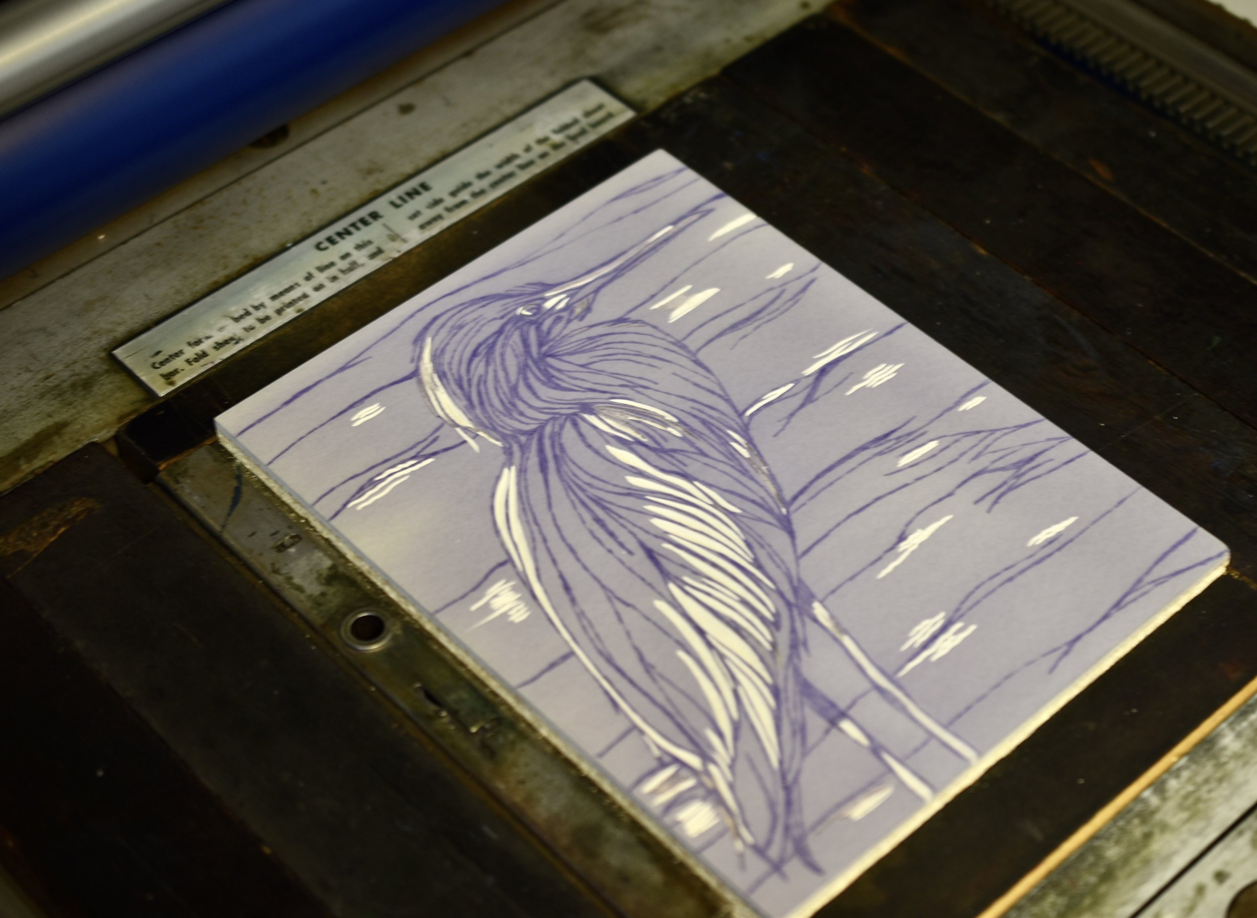
Here I am printing the first run of Barred Owl Nocturne in a pale gray-purple. This print was a seven color reduction print. Note that very little has been carved away that will remain the white of the paper (Cougar Natural).

The carved key block for Sanibel Blue, inked up and ready to print.

Final run of Sanibel Blue.

Sanibel Blue

Little Stories - Reduction Holiday Cards

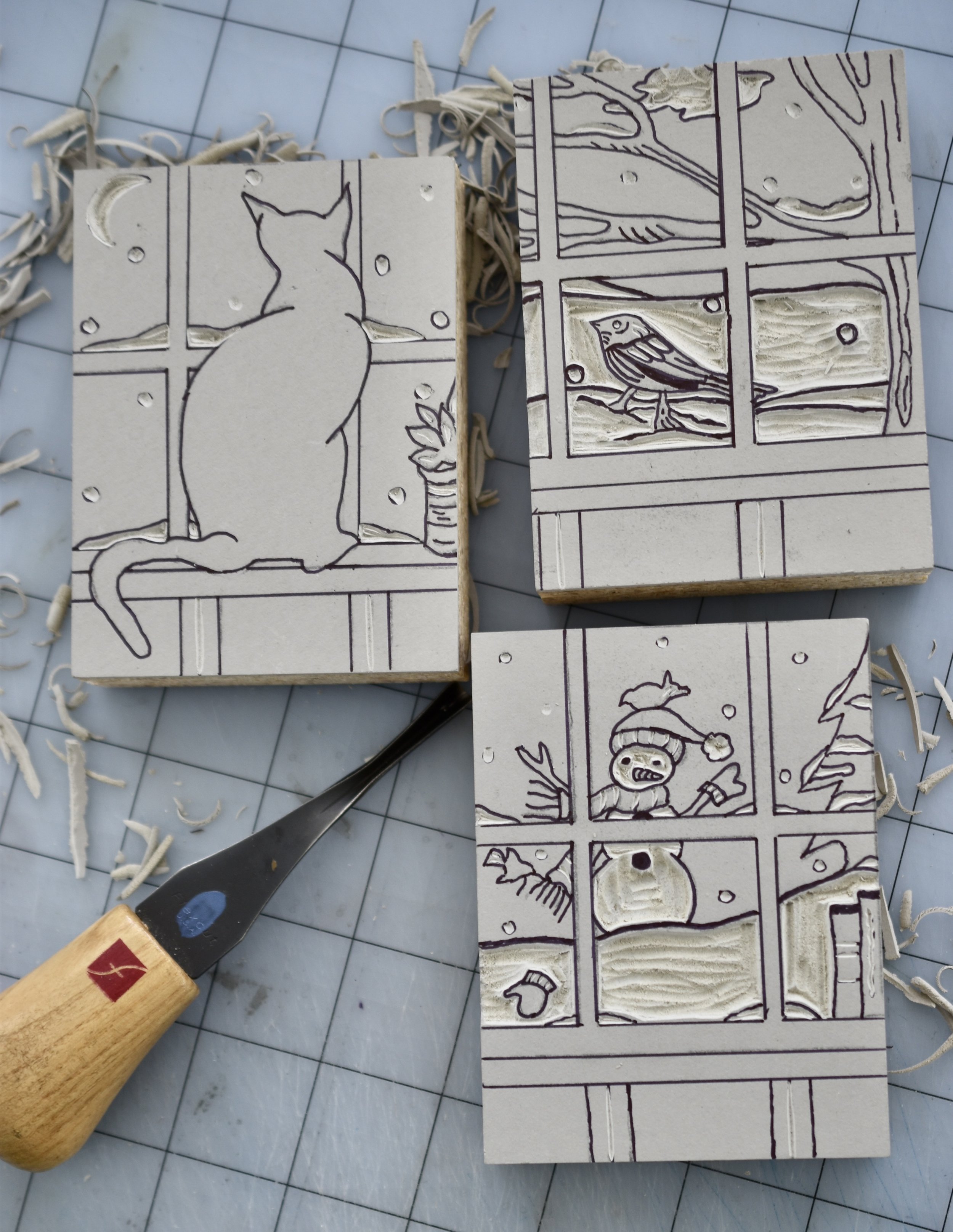
Each block is ready for the first run through the press. I have carved away each area that will remain white or the color of the paper. I am using Lettra paper.

The first run of the Snowman is complete. The story is just beginning to ‘come to life’.

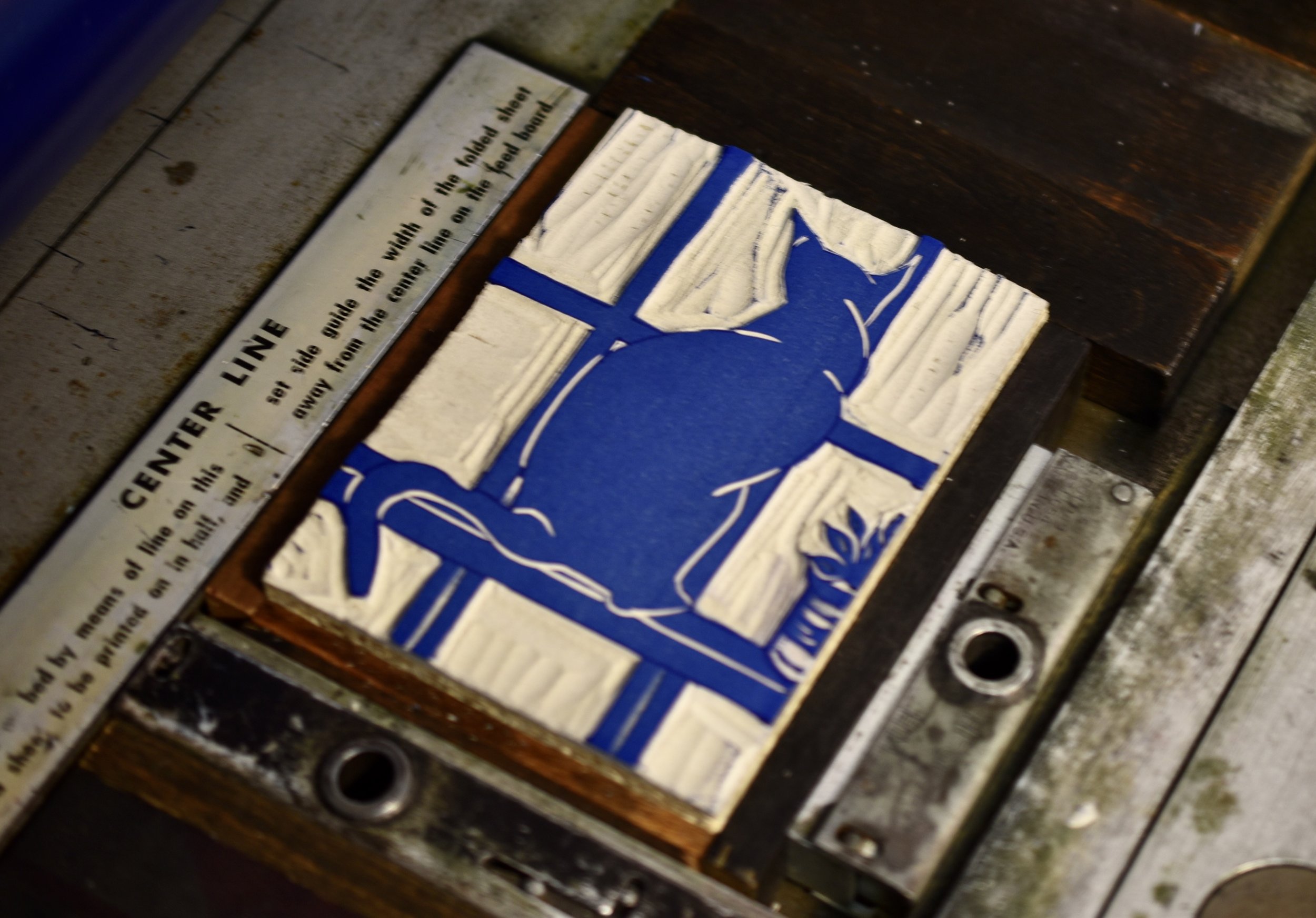
The Cat Looking Out the Window is my favorite of the three. This is because I have a 15 year old black cat, Espresso. She has provided much joy in my life and she often looks out a particular window in our home. I have carved away what will remain white in the finished print.

This is the Cat Looking Out the Window block inked up with the dark blue. Note how much more of the surface has been carved away, bringing the story to life.

The final printed edition of the Cat Looking Out the Window. This is my favorite. It is also the strongest of the three prints. The composition works beautifully - color, placement, and final image. Espresso was a great ‘model’!

Each Christmas holiday I produce several new holiday cards. This year I began by designing, carving, and printing a suite of three little stories. Each one provided the viewer with a scene beyond a window. Take a look at the process and each card.

The first color I printed for each image was a light blue. This is the Snowman story inked up and ready for printing.

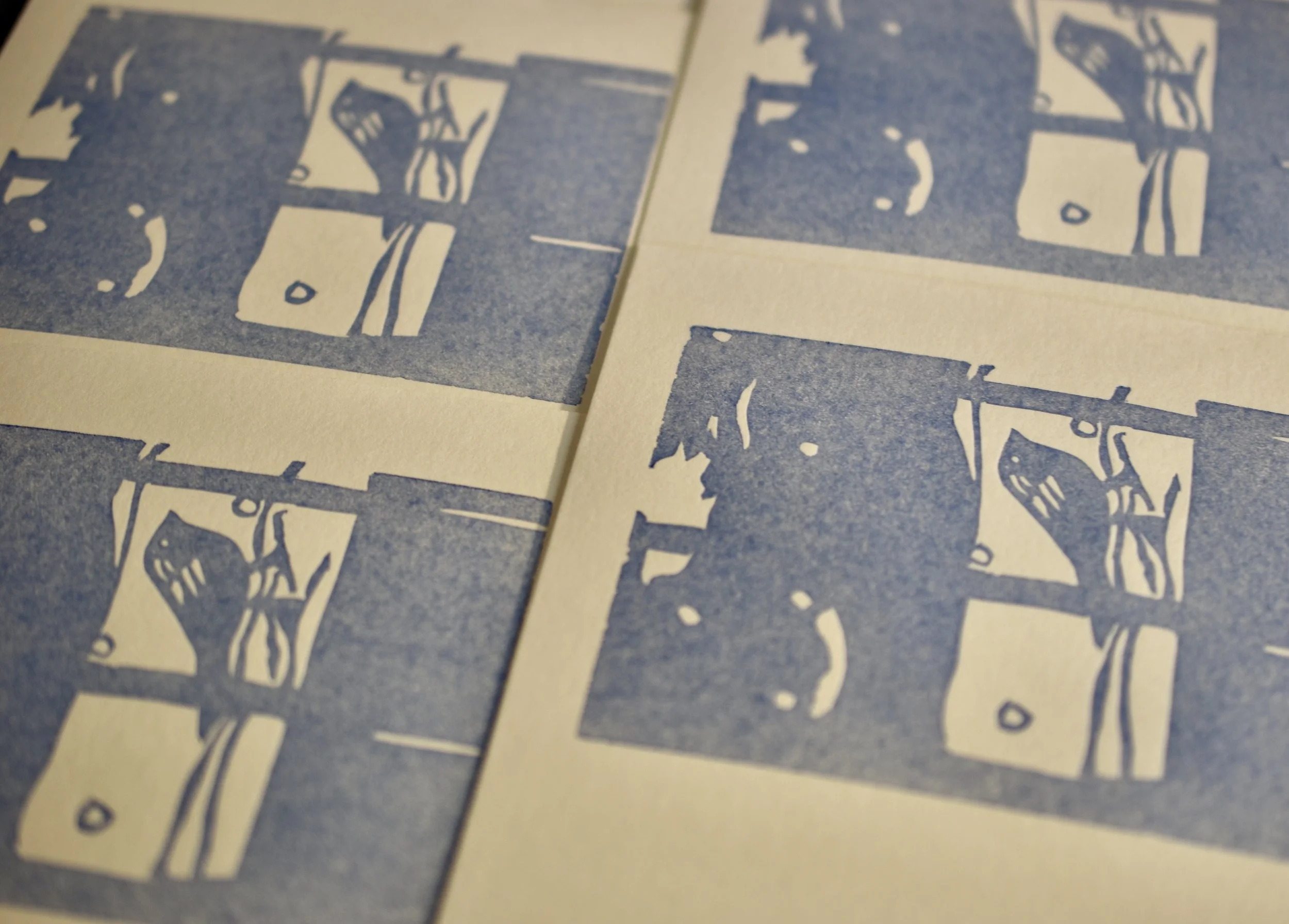
The first run of the Winter Bird is finished and the story begins! Note that in reduction relief printing the process begins with the lightest color and progresses through to the darkest and final color.

Here the block is inked and I am printng the first run and lightest color - a pale blue. I used this color on all three story images. I printed a total of four colors progressing through to a dark indigo blue.

The block for the Winter Bird inked up in the final and darkest color.

The three completed stories. These cards were a joy to design and print. They have been big sellers this holiday season.

PAY ATTENTION - A New Broadside

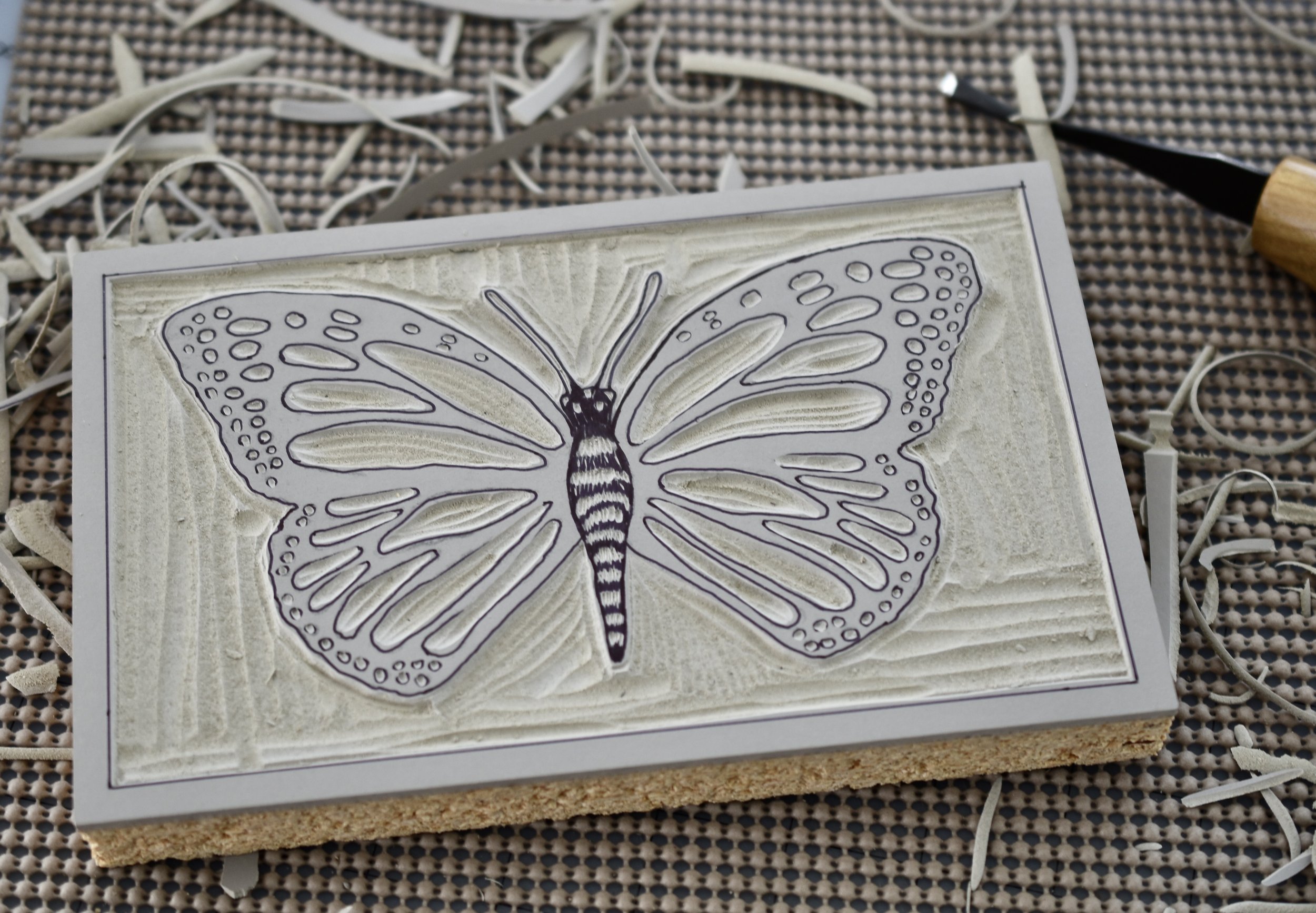
Carving the Monarch Butterfly.

Carving the Dragonfly.

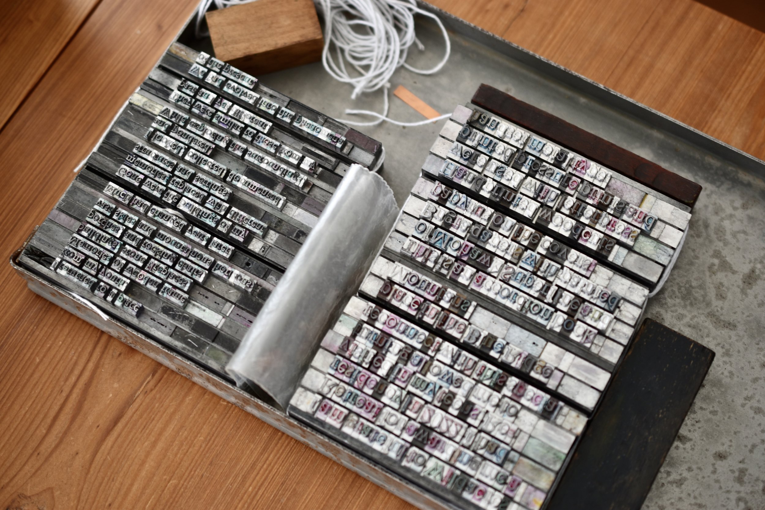
I set up a group of wood type blocks on the press and printed the underside of the letters. Printing this provided a subtle textured printed surface for the metal and wood type text.

Wood type form locked into place for printing. This was the final print run for this broadside.

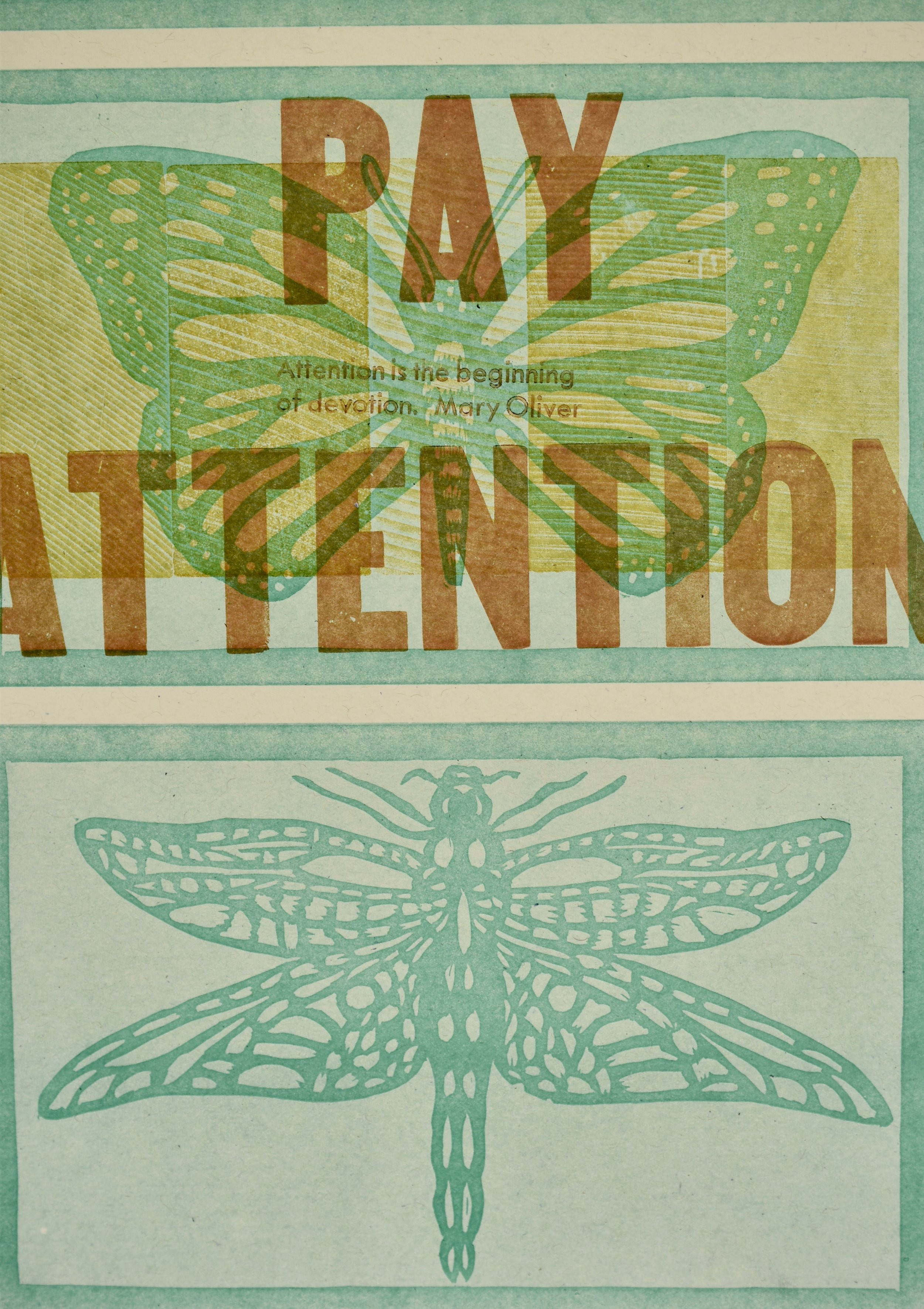
Completed print.

I have been a gardener for many years. The work of gardening is therapeutic; good for the soul and the body. It prompts me to think constantly about the environment and what I can do to be a good steward. My husband and I do not have any grass in our yard, we compost, we don’t use chemicals, we have a rain barrel and monitor our use of water. Additionally, we focus on planting native plants, particularly pollinators. I recently completed a new broadside using relief blocks, metal, and wood type. I also used a quote by one of my favorite poets - Mary Oliver.

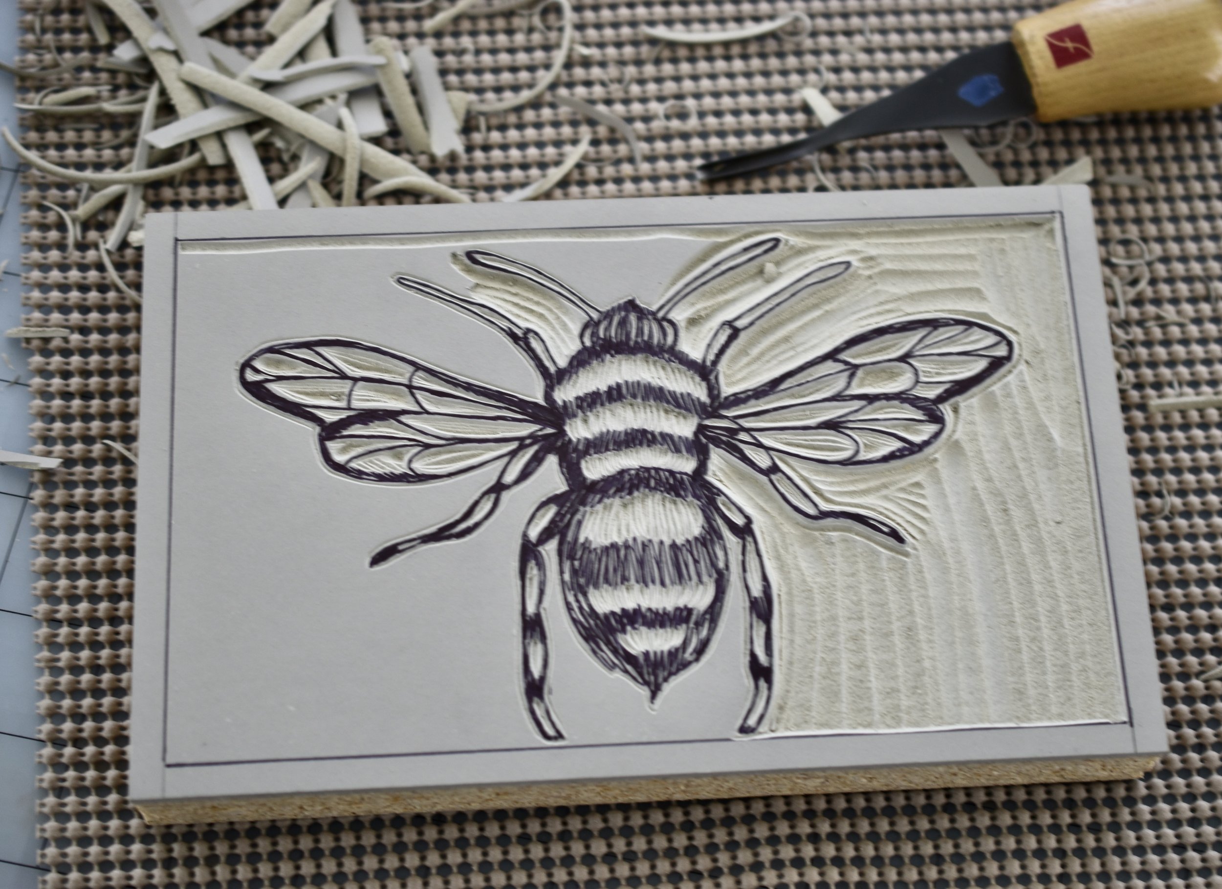
Carving the Bee.

Relief blocks set up and locked into place on the press, ready to print.

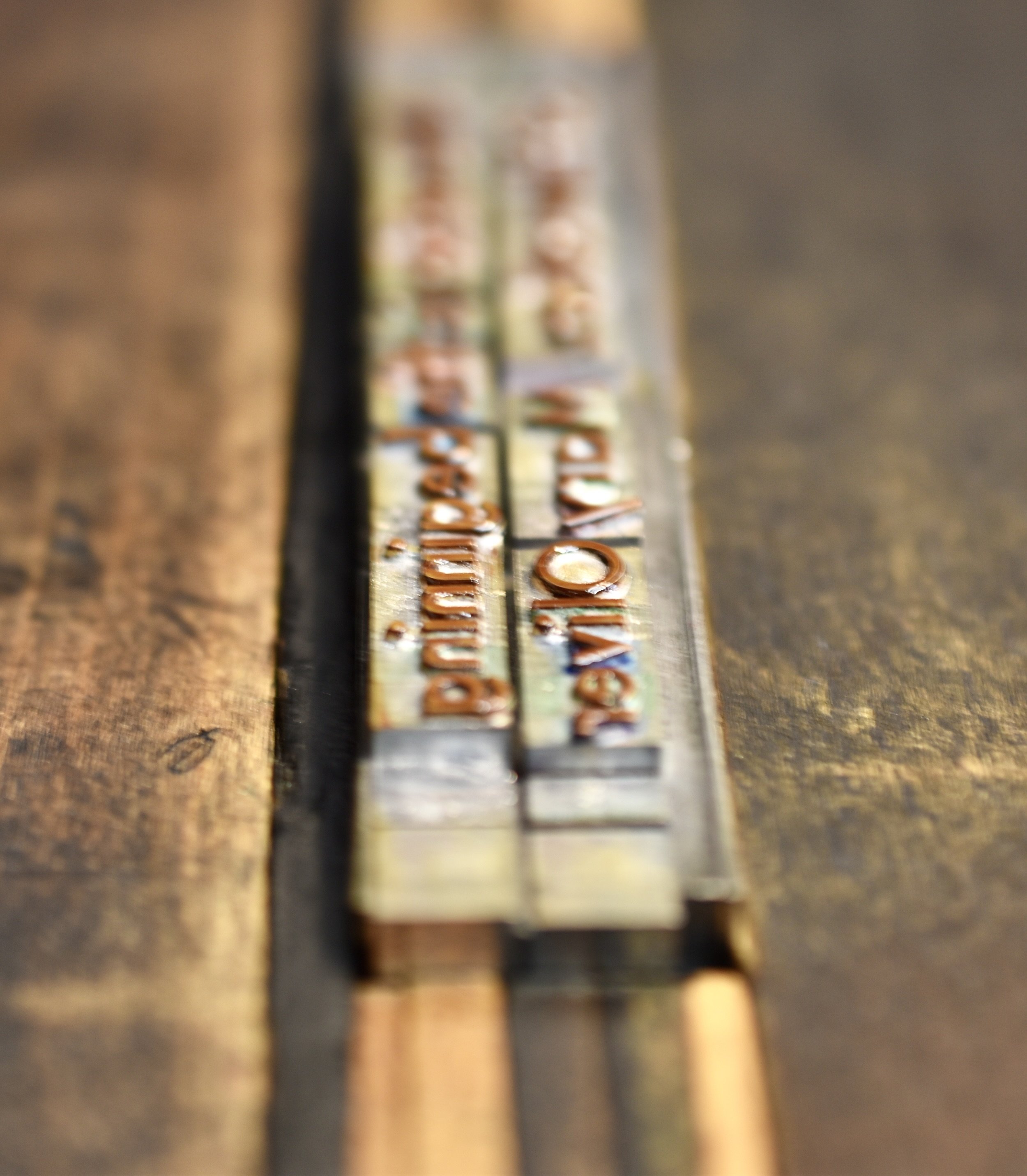
Metal type in Twentieth Century Modern set up and locked into place for printing.

Detail of the completed print.

“Attention is the beginning of devotion”, a quote by Mary Oliver is so true. Humankind needs to pay attention to the creatures and ecosystems of the natural world. We are a part of the interconnected web of life.

This print will be in the upcoming exhibition Degrees of Commitment, Climate, Ecosystems, Society; at the Arrowmont School of Crafts this Fall. Needless to say, I am thrilled!

The Making of an Artist Book - I Walk With PLANTS

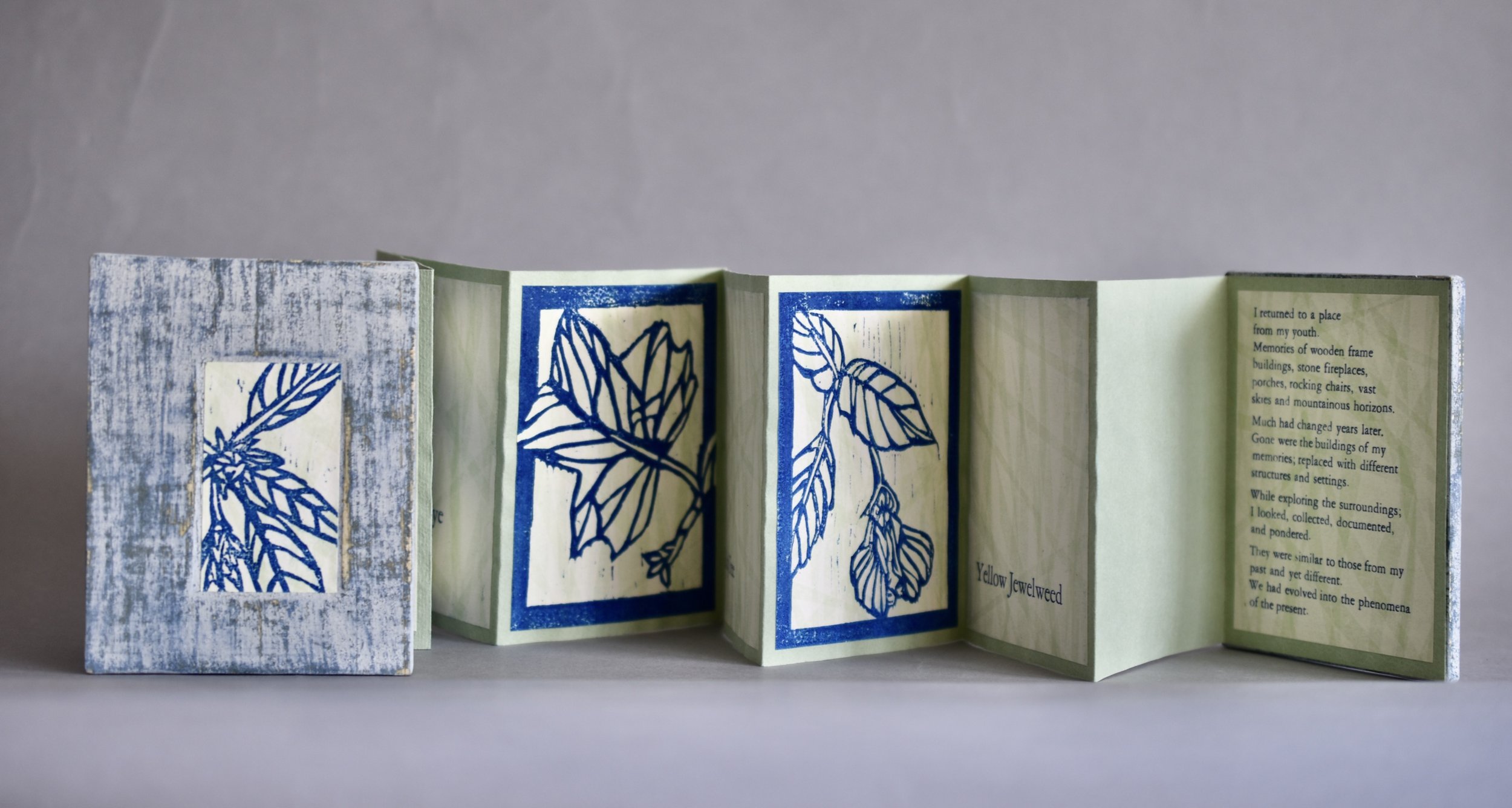
I returned home from the residency (mentioned in the previous blog) energized and inspired. I immediately began planning an accordion book using the woodcuts as imagery. I also began writing about my experience at Wildacres. A poem evolved from my writing and the title of the book was chosen - I Walk With PLANTS. I encountered a few technical challenges, but the project came together through work and experimentation.

I printed the woodcuts on pressure prints. The pressure prints were printed on Mohawk Superfine text weight paper. This makes a nice paper for use in artist books. I used Acua ink for these prints.

I set the poem in 12 point Garamond and the colophon and title in 24 point Garamond. I printed this on the same pressure printed papers as the woodcuts. Each woodcut was accompanied by printed title page (24 point Garamond) adjacent to it in the book.

I was pleased with how the leaf ornaments provided a decorative element to the title page.

I mounted the printed pages on Bugra paper. This paper works beautifully for many book structures due to how nicely it folds and the wonderful selection of available colors.

The cover is completed and the book assembled. Milk paint always works well on papyrus. The textured and painted covers combined with the woodcuts was very satisfying.

Title page form locked into place on the press, ready for proofing and printing. Notice the antique leaf ornaments. I added them at the last minute.

Botanical identification text forms set up on the press. I was able to print four identification pages at once.

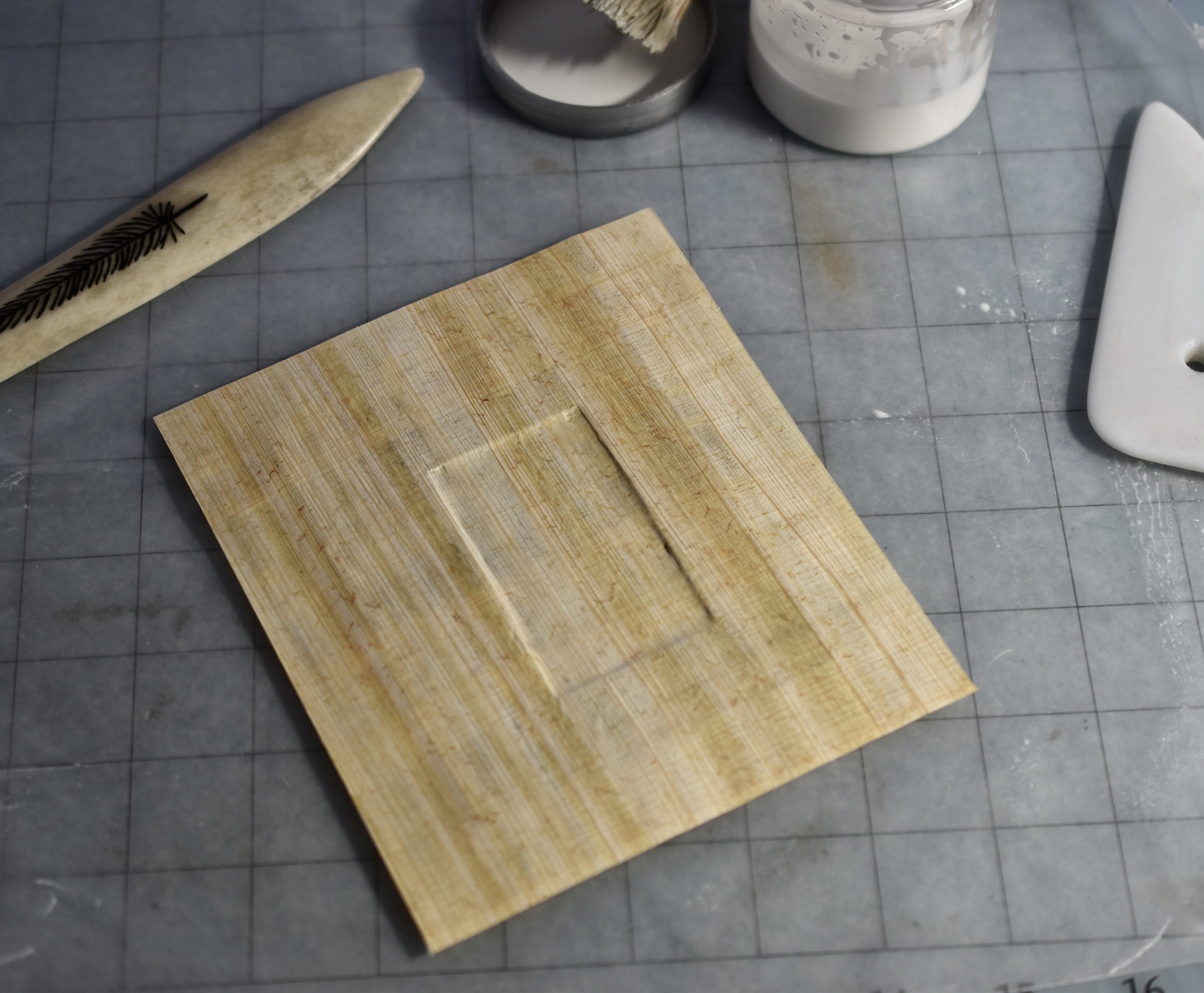
I used papyrus on the cover boards. Notice the recession. I added a print once the milk paint layers were sanded and polished.

The book was ready to be shipped to the Kalamazoo Book Arts Center! I have now participated in this open call for four years. It is always a rewarding experience.

I am most grateful to Wildacres Retreat for awarding me the Residency. The botanical woodcuts provided the foundation for this project. This was a wonderful opportunity for growth, learning, and a bit of adventure!

Documenting, Drawing, and Carving Wood Blocks of Botanicals - A Residency

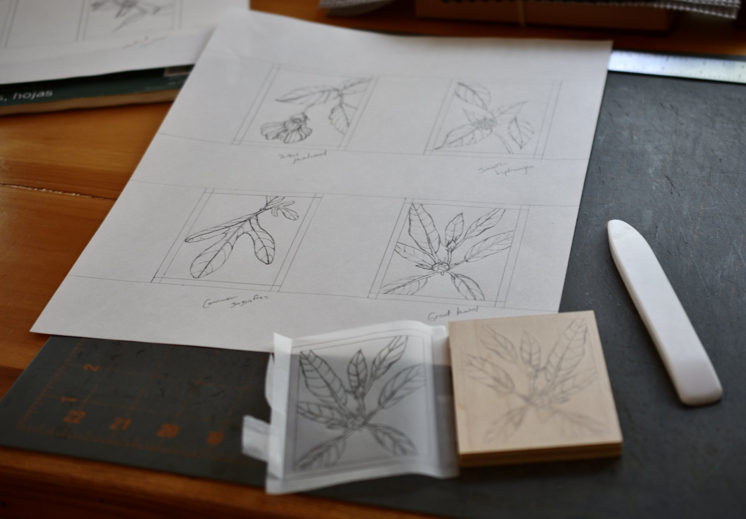
I began the drawings and woodblock carvings while completing a residency at the Wildacres Retreat near Little Switzerland, NC. It is a beautiful facility in the Blue Ridge Mountains. The time away from home allowed me to focus on exploring the surroundings, gathering and documenting botanicals, completing a suite of drawings and subsequent carvings. Here, the drawings have been transferred to blocks and are ready for carving.

My workspace in Laurel Cabin; what a beautiful view!

Eight of the ten blocks I carved while at Wildacres. I used Shina plywood purchased from McClain’s Printmaking Supplies. It is a bit softer than standard plywood and much nicer to carve.

Drawings of botanicals, woodblock carvings, and text set in metal type were all incorporated into an accordion fold book titled I Walk With PLANTS. This was my submission to this year’s The Illustrated Accordion open book exhibit hosted by the Kalamazoo Book Arts Center in Kalamazoo, Michigan. It was a rewarding endeavor; though challenging and tedious at times.

I stayed in this wonderful cabin during the residency. It was a 20 minute walk from the lodge and dining hall. I walked to all of my meals. This proved to be a great time to observe the surrounding woods and gather imagery for the project.

Simple line drawings are traced, taped to the wood blocks and transferred using a bone folder.

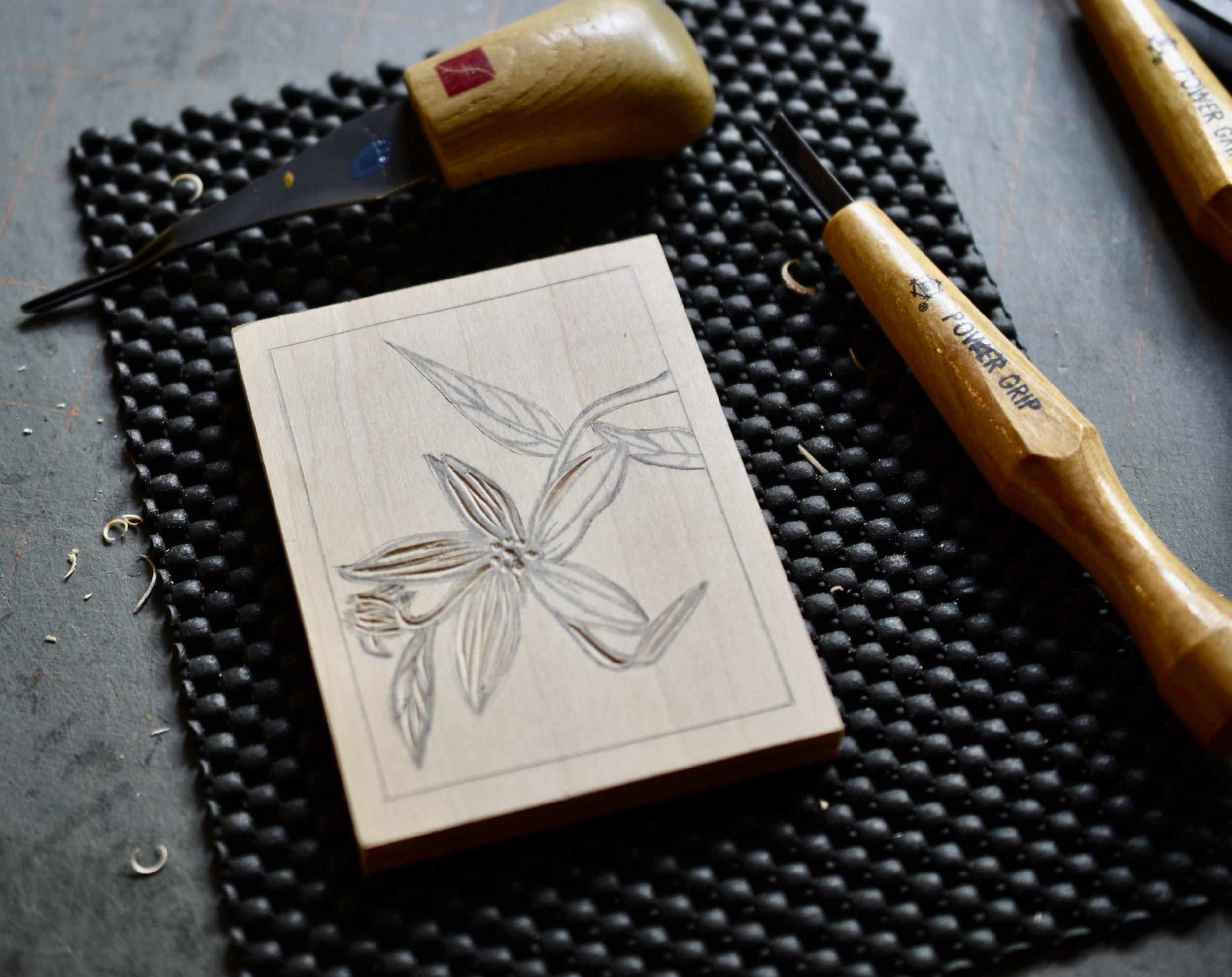
Carving a block. These were the first wood blocks I had carved. My experience carving linoleum blocks proved beneficial. I bought a set of carving knives specifically for wood. They are Power Grip cutters. These knives worked well. However, I plan on purchasing better quality cutting tools should I carve additional woodblocks in the future. These were great for learning the basics of carving on wood.

I had carved ten blocks. I was tired, sore, and yet full of gratitude for this time to focus and work.

It was now time to return home and complete the project - printing a suite of prints and making an artist book about this time in the mountains.

Fun Designing and Printing 'Dog Themed' Cards

I was happiest with these four images after completing numerous drawings. I included our black cat Espresso in one sketch. She and Toby have adjusted to one another over the years. It seemed right to have one of them together on the same card. Notice that two cards will have a vertical orientation. The other two will be horizontal.

Carving is underway. I am really fond of these Flexcut carving tools.

I printed the cards on chipboard. This image is my favorite of the four cards. I love walking Toby and he enjoys it as well.

A friend asked me to design and print cards featuring dogs as the theme. I was a bit perplexed with the idea at first. Once I began to watch and observe our dog Toby; sketches evolved. I had loads of fun watching him and writing salutations to accompany the images. Stepping outside one’s ‘comfort zone’ opens up all kinds of new possibilities.

I transfer the sketch to the lino block using tracing paper and a mechanical pencil. After tracing the sketch, I attach it to the block face down with tape. Next, I rub over the drawing with a bone folder. Finally, I go over the drawings with a Sharpee pen. This facilitates the carving process.

Carving this block is completed. I am now ready to proof and print.

I added a bit of text to each card using handset metal type. My wish that human beings could be more accepting of one another is the underlying theme with this card.

The cards are printed and ready to score, fold, and package. Getting started on these cards. was a bit challenging. However, the process proved to be beneficial. I did a great deal of thinking about how much joy Toby and Espresso bring into our home. That, in and of itself was rewarding. Having the completed cards was ‘icing on the cake’!

Flower Power - 2023 Letterpress Printed Calendar

I had several carved flower blocks from previously printed cards. I used them in addition to these eight new blocks. All of these flowers grow in our gardens. I find the drawing process very satisfying.

I go over the drawings with a Sharpee pen once I have transferred the image to the block. This facilitates the carving process.

Carving the Daylily. This is my favorite of the new blocks. Consequently, I selected it for the cover image.

I used Cougar Natural, 100 pound text weight paper. It is a nice durable paper for a calendar Here it is cut, stacked, and ready for printing.

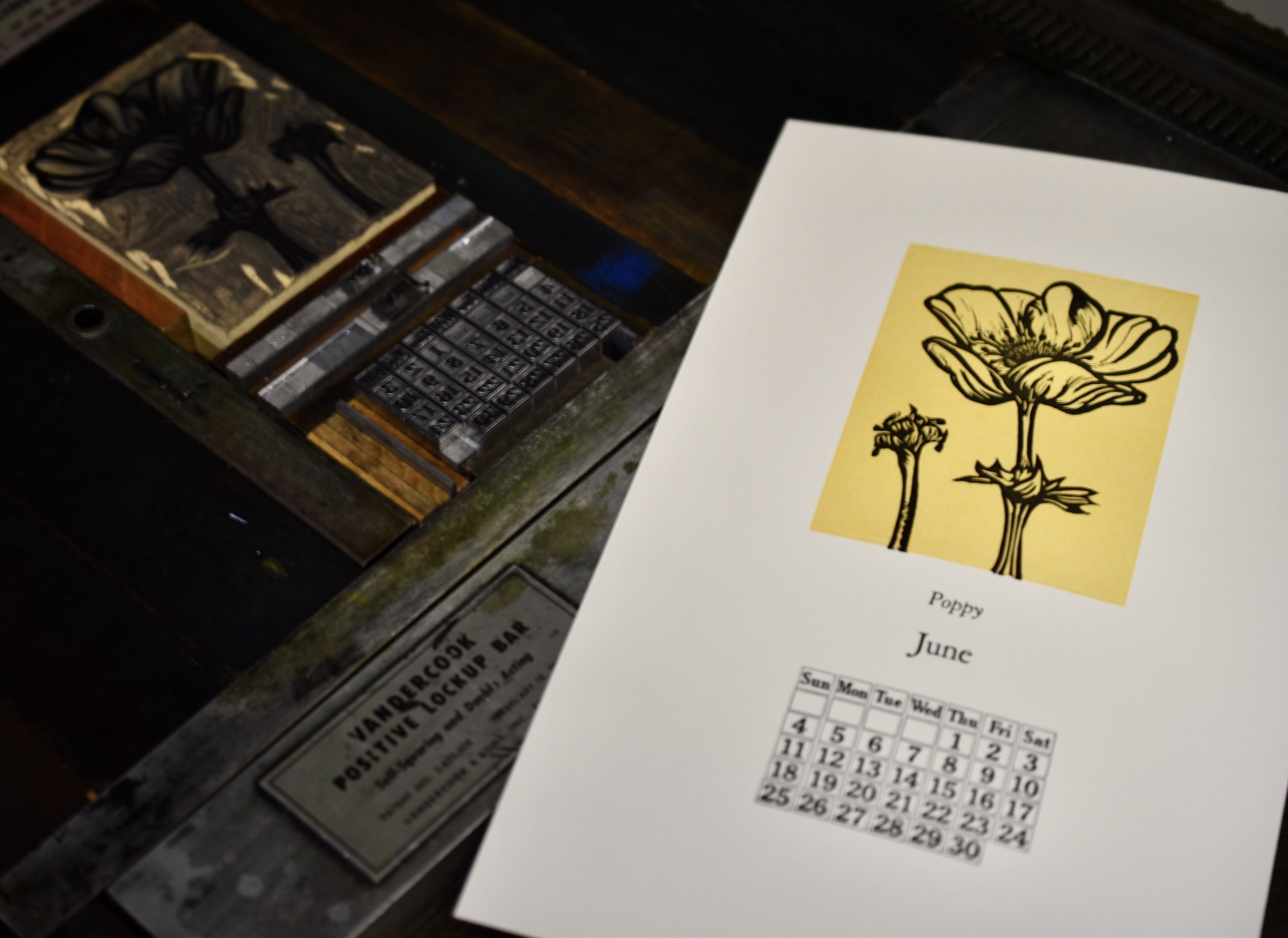
I printed the Poppy for the month of June. This is one of the flowers from the Blue Sky Botanicals card set.

The calendar cover using wood type for the title - Flower Power! I love the chartreuse green I used for the Spring months.

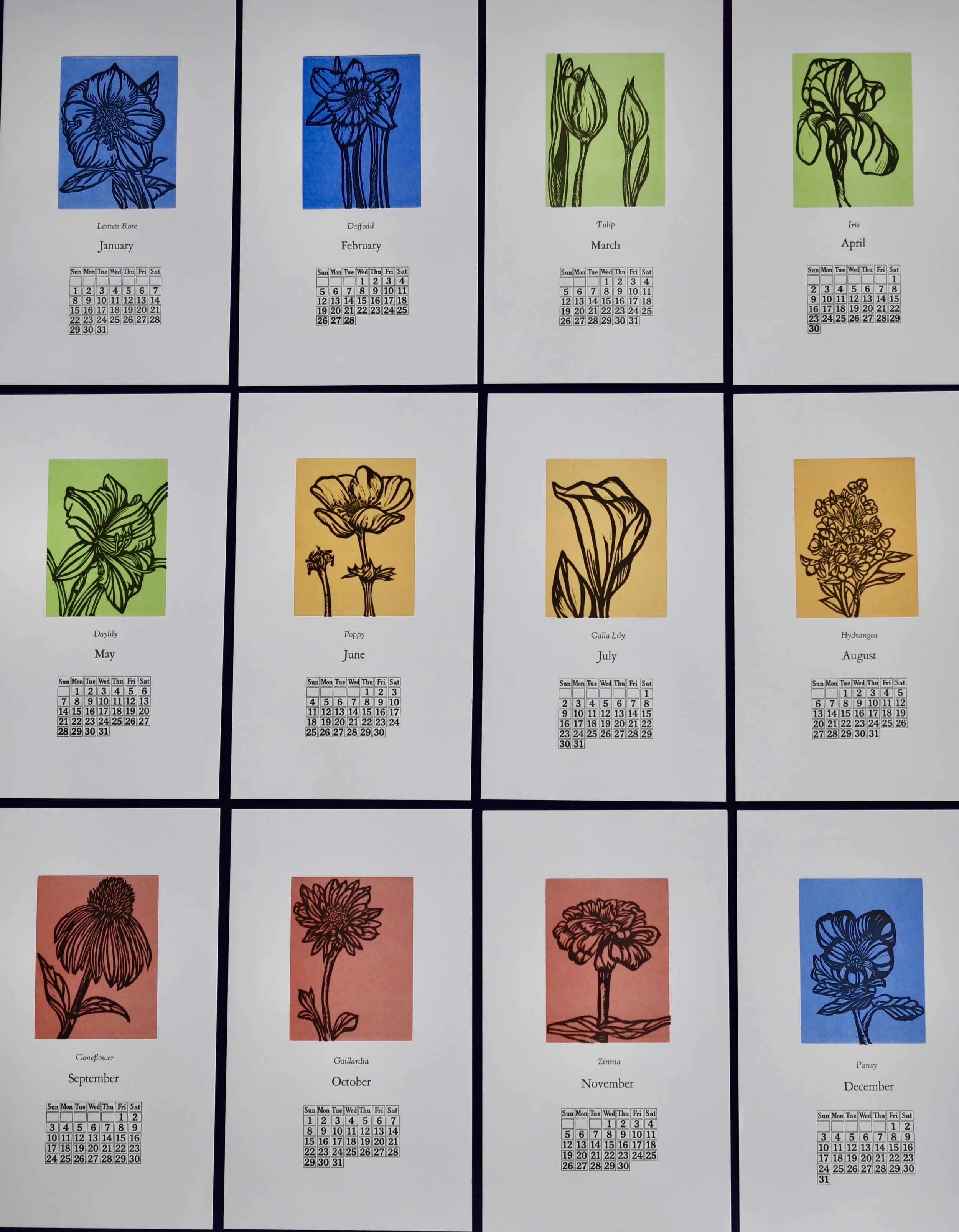
The completed calendar showing all twelve months. I really love how it turned out. The metal perpetual calendar form never disappoints. It printed beautifully!

I printed my 2023 calendar a few weeks ago. Flowers from our garden inspired the imagery. I learned a fair amount when printing last year’s calendar and made a few changes in format and process this year. I carved on larger blocks (3”x4”) than last year and used a variety of colors for the mats (instead of one color for all twelve months). I believe the resulting calendar is stronger in many ways.

Detail of drawings.

The coneflower is one of my favorite flowers. They are a bit tedious to carve but fun as well!

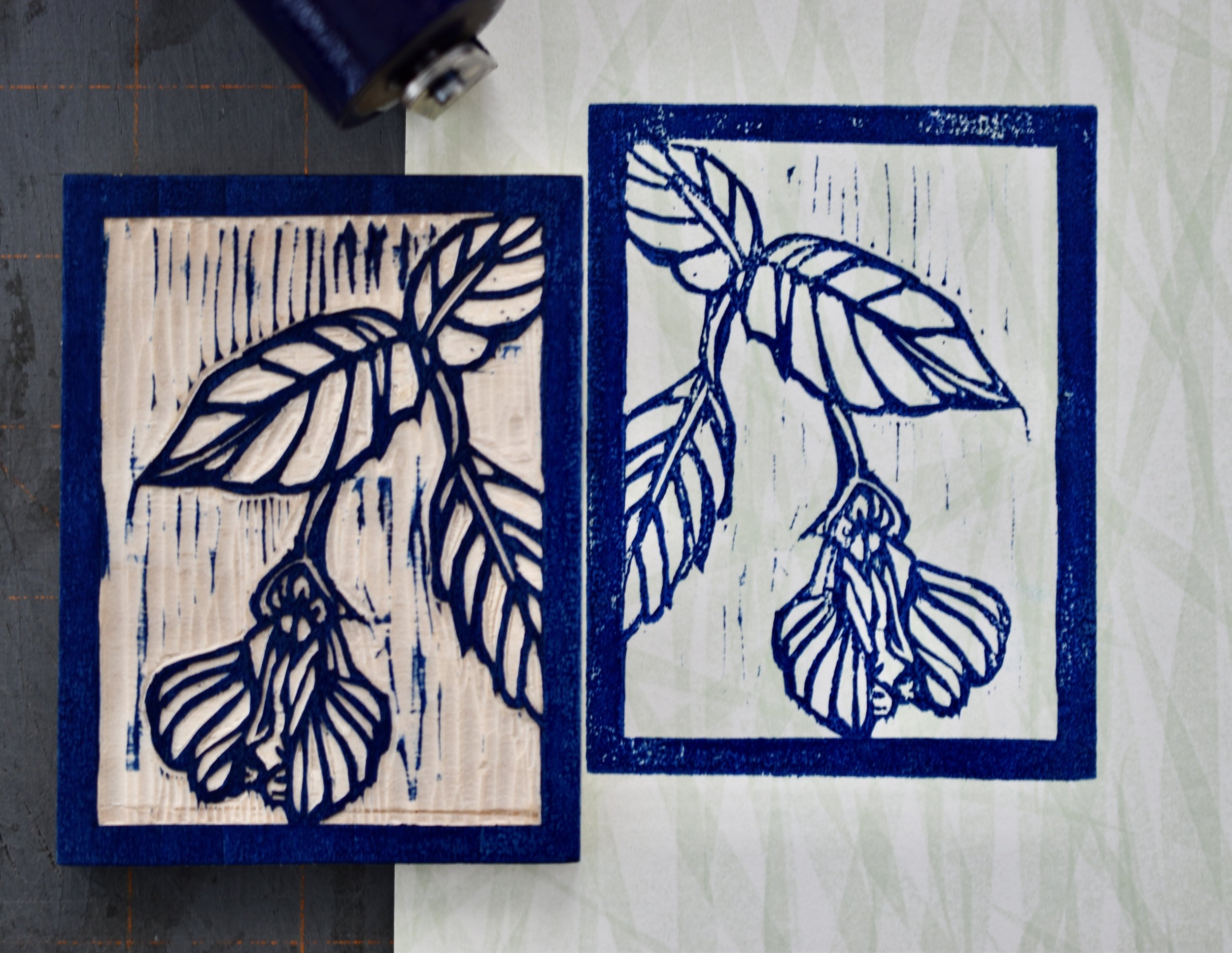
I printed a colored mat for each month of the year. This blue was for the months of December, January, and February.

The Lenten rose is the flower for the month of January. This image shows the set up on the press for printing each month.

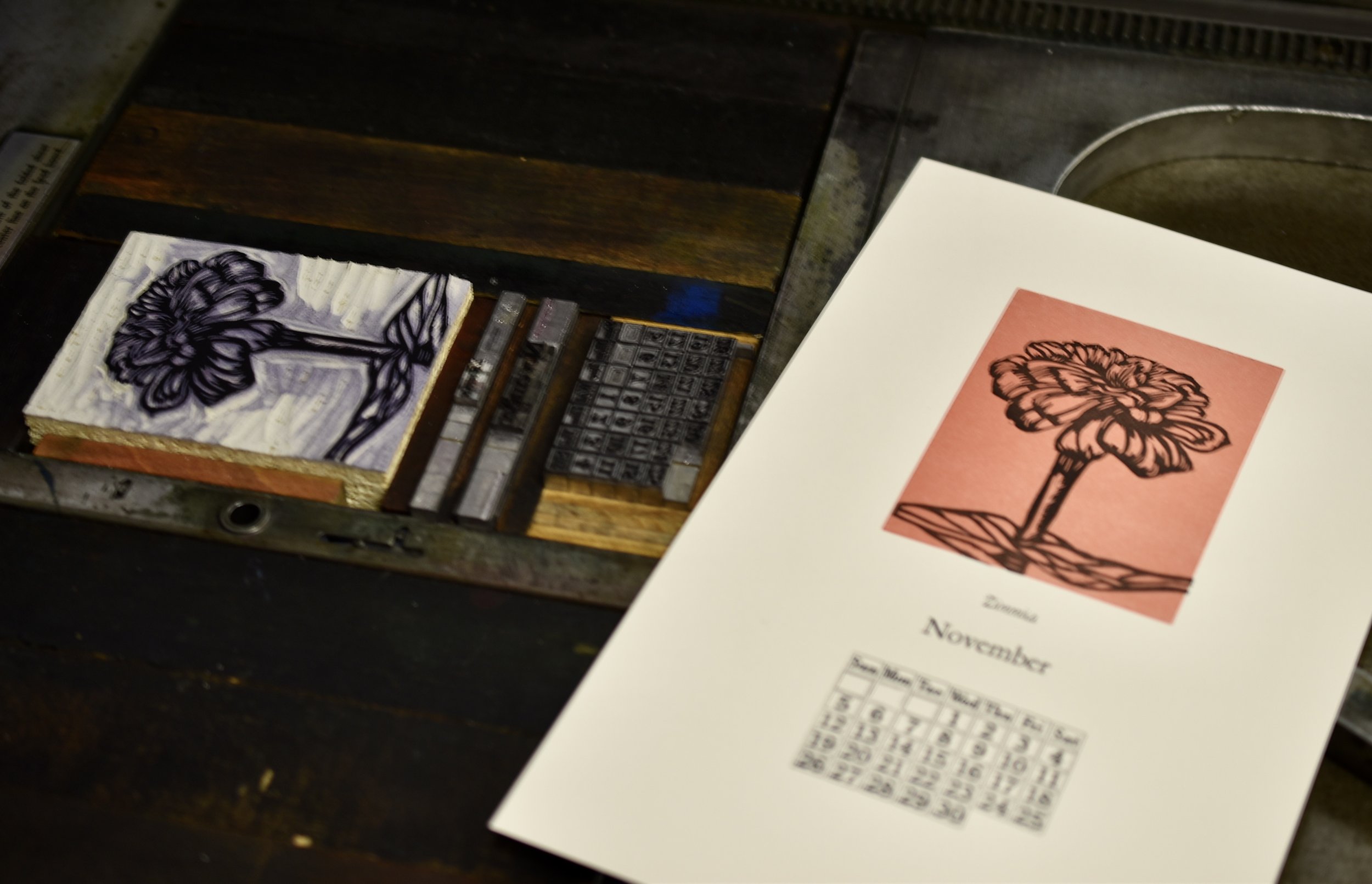
I printed another favorite for November - the Zinnia. Notice that I was able to print both the text and the image block at the same time. This sped up the printing and limited the number of runs through the press to two runs per month.

This image shows the carved blocks I used. I have been carving relief blocks for some time now. I have decided the gray linoleum is easier to carve than the tan colored linoleum. It is a bit less hard and brittle.

Embed Block
Add an embed URL or code. Learn more

A New Set of Botanical Greeting Cards

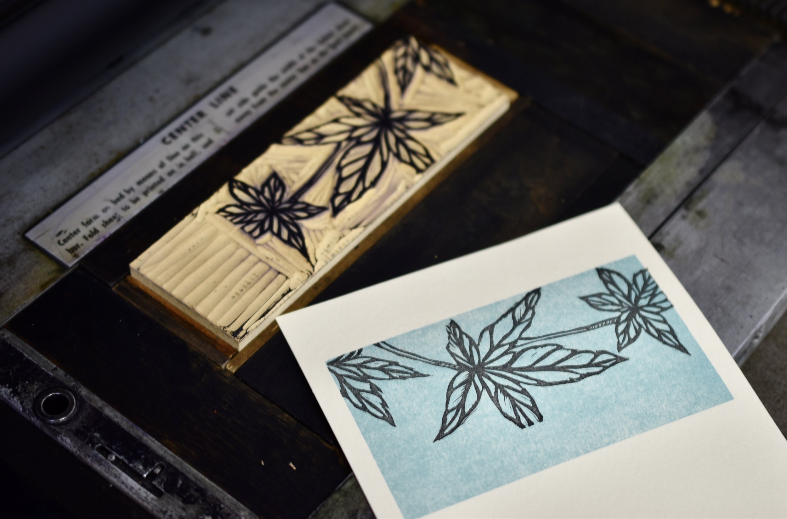
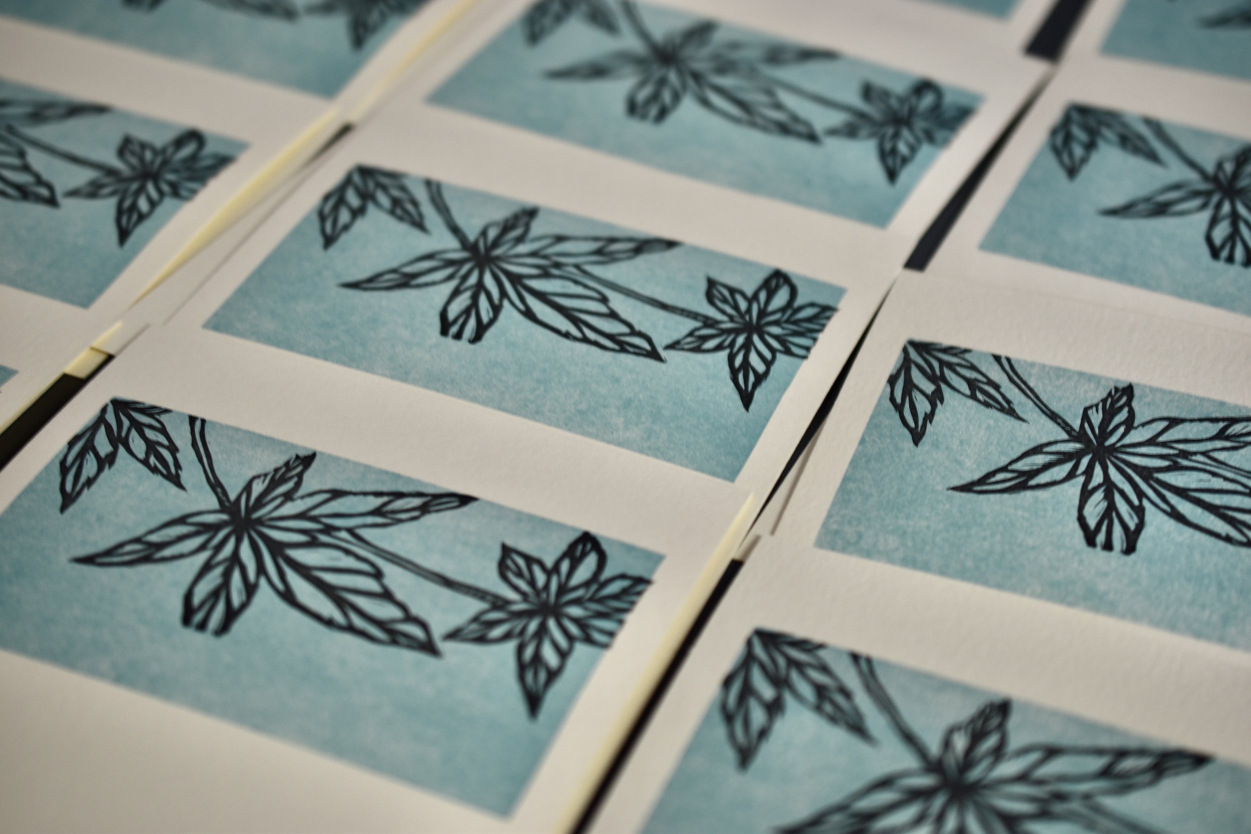
I recently completed a new set of four cards inspired by spring botanicals in our gardens. The blocks were an odd size. They had been cut off of larger blocks several years ago and set aside. I drew, transferred, and carved the images to fit into the space. It sounds harder than it was and I am pleased with the cards. I carved four blocks; one of Ginkgo leaves, Japanese Maple leaves, Forsythia, and the Lenten Rose.

Ginkgo leaves carved.

Carving the Forsythia. I am pleased with these delicate flowers!

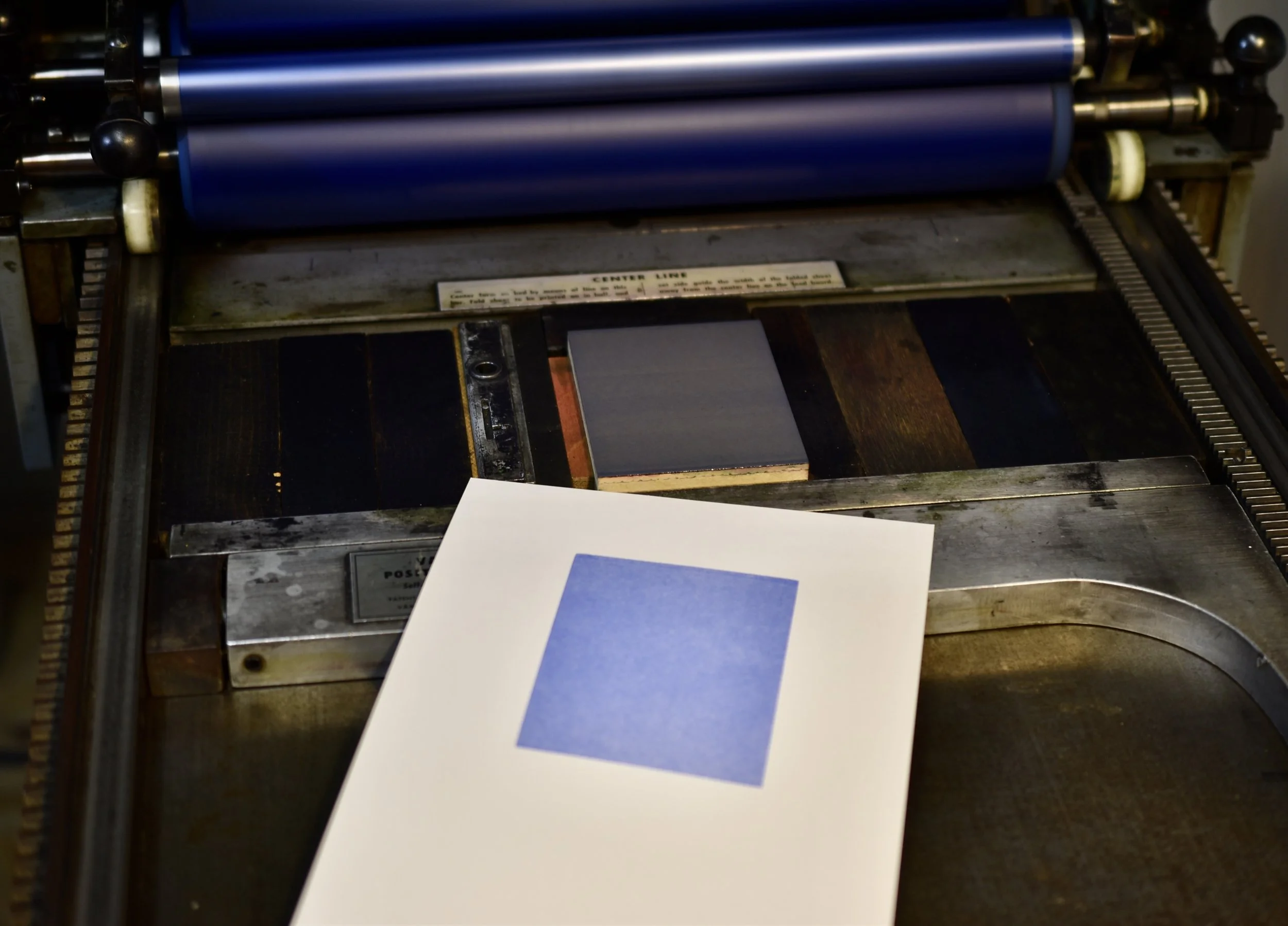
I printed a light teal mat for each image. I then printed the botanicals in black.

Ginkgo leaves edition.

Lenten Rose edition. Designing, carving, and printing from these refurbished blocks was a satisfying experience!

The Lenten Rose is carved.

All four botanicals are carved. Notice the empty space at the end of each block. I had to carve that off in order for the images to fit on the Lettra paper I used for the cards. I am now ready to head to the print shop to proof and print the cards!

Japanese Maple edition.

Forsythia blooms edition.

New Botanical Prints Inspired By Spring

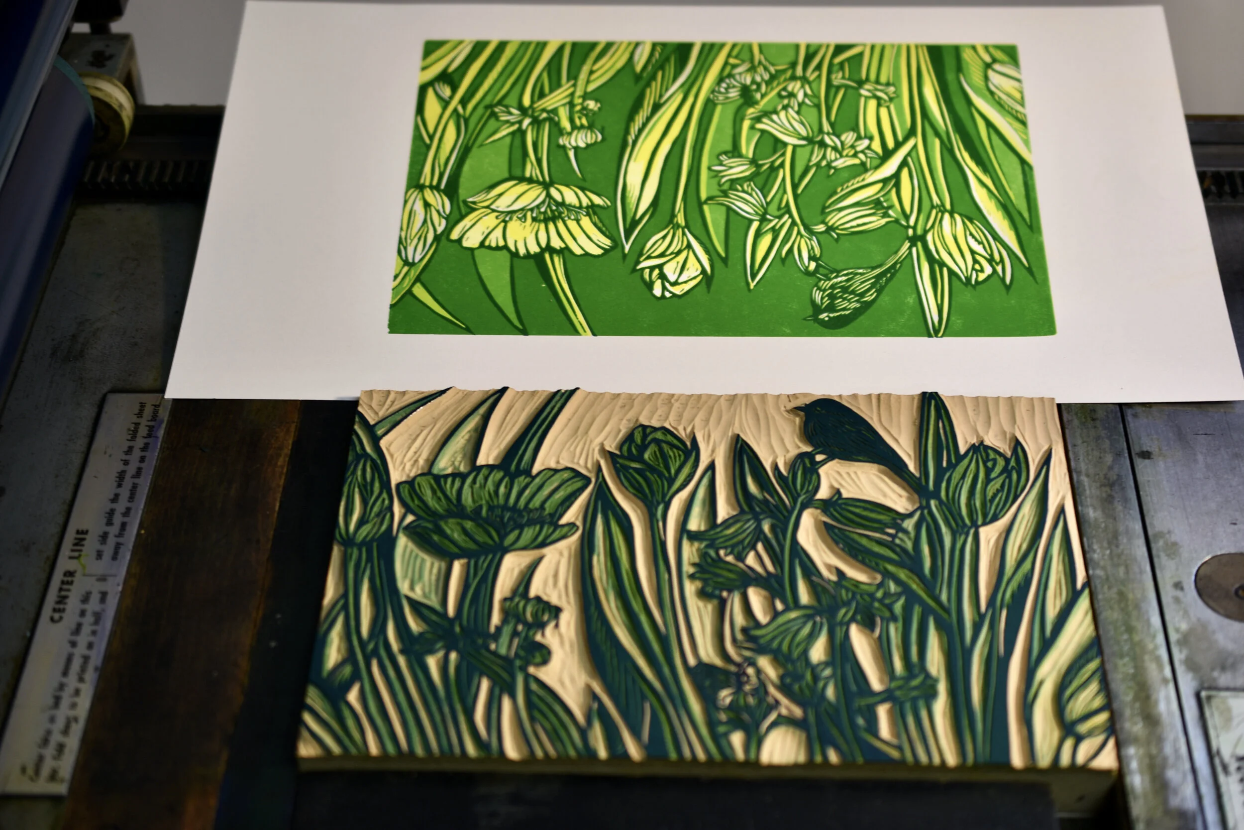
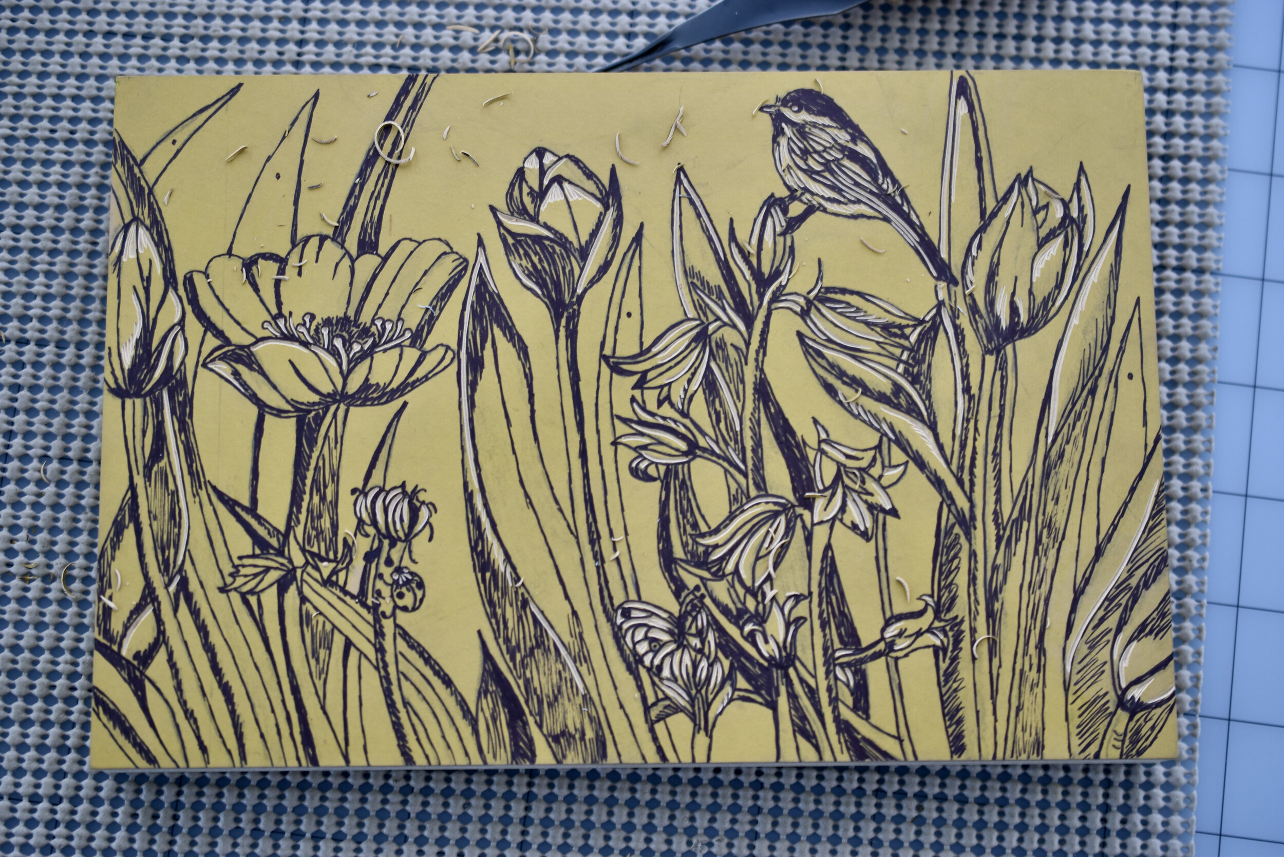
Spring was a welcome change from the cold days of winter, I decided to complete a suite of botanical prints exploring composition and color. The tulip, coneflower, and allium are three of my favorite flowers. I will share the processes I used to complete the prints. I began by completing a series of pencil drawings. I then traced the drawings and transferred them to the linoleum blocks.

The traced tulips and coneflowers have been transferred to linileum blocks.

Carved coneflowers, ready to proof and ptint.

I am now ready to print the three blocks. I will use Zerkall book paper. It has a lovely surface for printing. I may have to do a bit of additional carving once I am on the press and see how the images print. However, I am pretty confident that these images will print beautifully. with few adjustments or changes. Let’s head to the print shop and my Vandercook!

I printed a colored mat for each print. I chose warm red for the coneflowers.

I printed small editions of 10-11 prints and used black for the images. The coneflowers printed beautifully.

The was a rewarding project for welcoming Spring.

The allium is also transferred and ready for carving. Note that I have gone over each drawn image with a Sharpee pen. This facilitates the carving process. It helps me to know both the positive and negative space of the compositions. Additionally, the pen is permanent and will not come off while I am carving.

The alliums are carved. I am so pleased with this carved block and the detail of the flowers!

The tulips are carved and ready to proof and print.

The alliums looked great on this violet hue.

A pale teal worked nicely as a mat for the tulips.

Making an Artist Book

I began 2022 by designing, printing, and making a new artist book. The book is titled SWIFT Encounters. It is a tribute to chimney swifts. For several years now I have gone and observed the chimney swifts that stop off in Greensboro as they migrate to warmer climates. It is most engaging to watch this phenomena as they dive into the large chimneys that still remain standing. Many have been torn down or blocked preventing the swifts from using them for their annual ritual. One chimney not far from my home is on the back of a music and movie venue. Another is at an elementary school. The swifts convene around sunset and eventually dive into the chimneys to sleep. It is a beautiful demonstration of community. The following images further explain the book which I did for The Illustrated Accordion hosted annually by the Kalamazoo Book Arts Center in Kalamazoo, MI.

I began by making pressure plates to use as a ‘background’ for relief printed imagery. This brick network was based on bricks found in the chimneys where I observe the chimney swifts.

Drawing and planning - this image will be carved and printed on handmade paper. A model of the floating accordion book structure is behind the sketch.

The printed proof.

The print of the swift and chimney print were attached (using PVA) to this pressure printed page.

I used papyrus on the front and back cover boards. I also cut a recessed area on the front board.

I polished the cover boards with black Kiwi shoe polish after a bit of sanding to smooth the milk paint surfaces.

I used the recessed area of the front cover to set off the text and swift image. Note the pressure printed bricks and swifts on the back of the book.

I made a belly wrap to hold the closed book together.

This second pressure plate was inspired by swifts as they fly and convene with one another.

The image is now carved and ready to proof.

I printed the swift and chimney image on a pressure print which I printed on handmade paper. I planned the book knowing that this image would be on the ‘floating accordion’ part of the book’s front page.

The cut and folded sections support the ‘floating’ images which are the focal point of the book.

I then applied layers of milk paint.

I assembled the components. Note the bits of text which I printed on my Vandercook using 12 point Garamond. The text is a brief statement about the swifts (right side) and the Colophon (left side). I was pleased with how the pressure printed bricks provided a uniting element for the text and printed swifts.

I have participated in the Illustrated Accordion for several years now. I look forward to this opportunity to exhibit with other book artists from all over the world!

Holiday Fun - Exploring Origami While Designing An Ornament

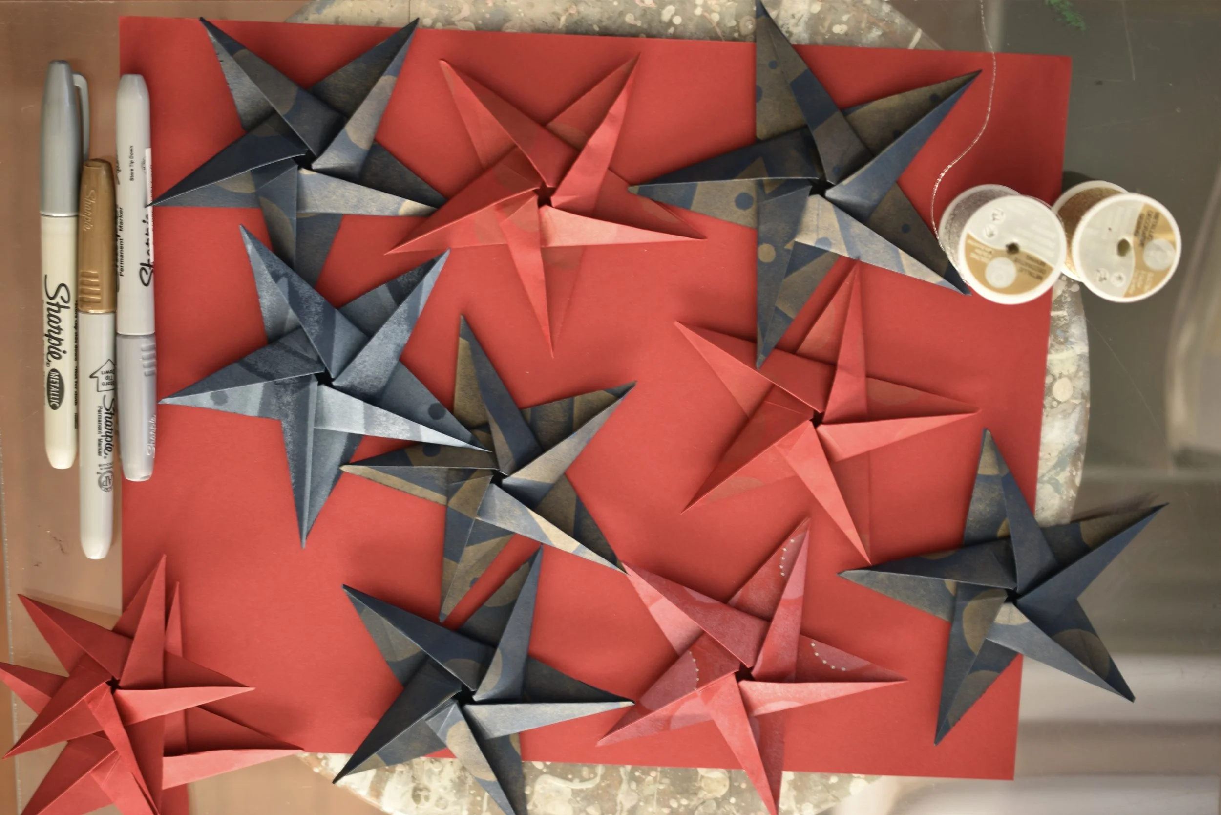
I printed patterns using white and gold ink on Electric Red and Nightshift Blue French paper. These papers were 70# text weight from the Construction Paper Line of French paper.

Folding and cutting pentagons using the Nightshift Blue French paper.

Folding the pentagon into the star. The side which doesn’t show on the star is on the inside when folding the paper.

I added a bit of drawing using metallic markers. This drawn detail added some whimsy to the pressure printed designs.

I enjoy the challenge of making Origami forms. Consequently, I decided to create a holiday ornament using pressure printed sheets of French paper folded into the five pointed origami star. Not only was this loads of fun; the completed ornaments are wonderful.

I then cut the pressure prints into squares. The squares were folded and cut into pentagons before folding the five pointed star.

Folding red pentagons.

Completed stars; with metallic thread added for hanging.

This red paper was printed with white ink and the drawing was done with a silver pen.

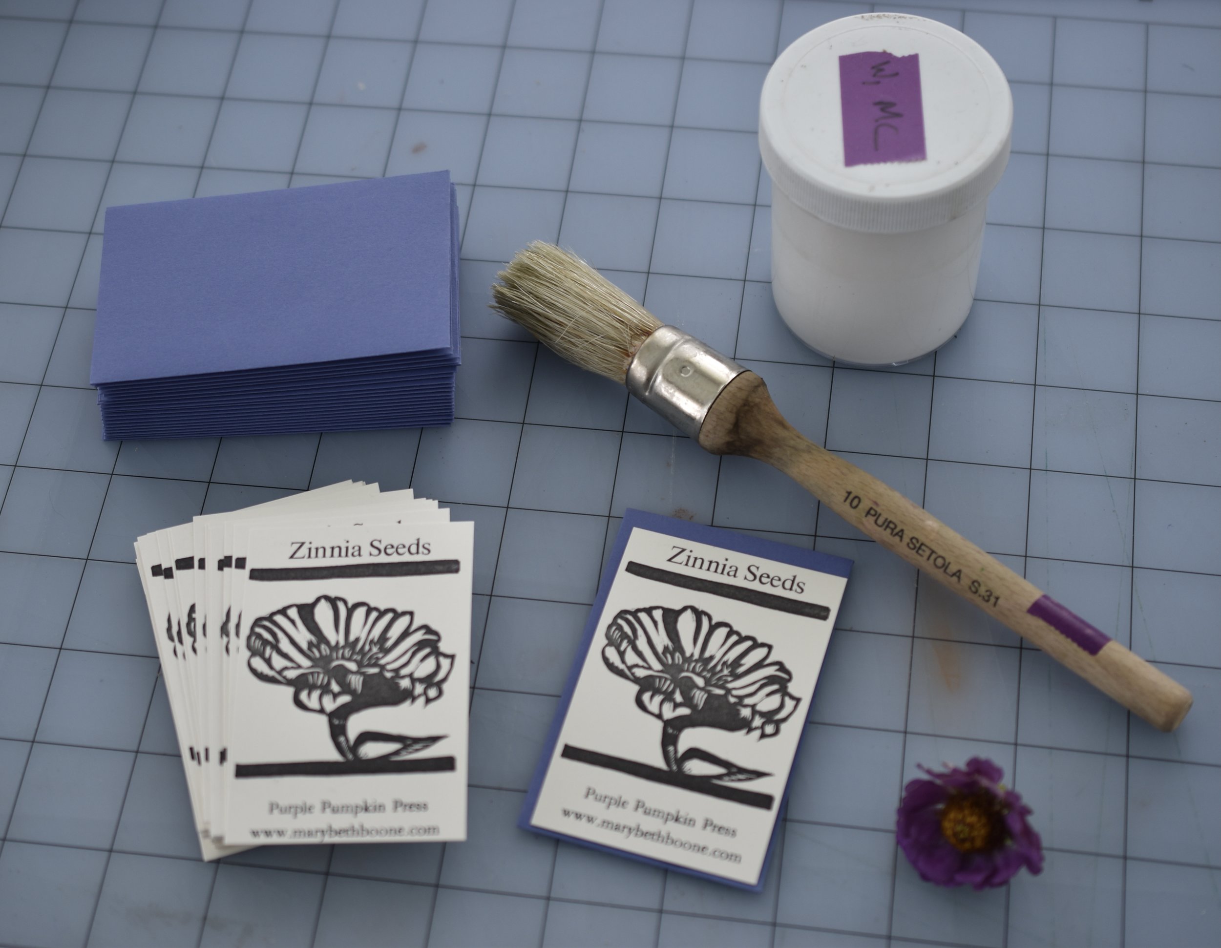
Inspired by the Garden - Zinnia Seed Packets

Tracing a pencil drawing to transfer onto the 3”x2” linoleum block.

I cut the prints into rectangles which I attached to purple 3.5”x2.25” envelopes. I added the dried zinnia seeds once the attached prints had thoroughly dried. The finished packets were well received by recipients!

One of my favorite flowers is the Zinnia. I love their variety of colors and tolerance to heat and drought. The birds, bees, and butterflies in our gardens are fond of them; particularly the goldfinch. I am also grateful that they last through the summer into the onset of fall. I decided to dry blooms during the summer and create seed packets to give to friends and family. This was a fun and rewarding project!

The image has been carved and is ready to proof and print.

I printed the image on Cougar Natural 100 pound cover weight paper. Before printing the zinnia flower; I printed the name of the seeds and my imprint and web site on the paper (using 12 pt Garamond metal type).

Drying and soon to be packaged with seeds!

A Most Remarkable Experience During These Challenging Times

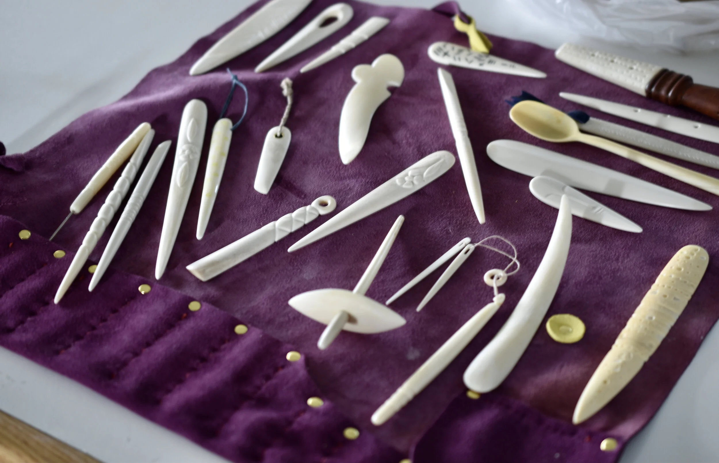
After introducing ourselves at the start of the class, we learned how Shanna gets her supply of Elk bone and had a peek at pieces she had cut. We selected from these pictured pieces which she had cut into a variety of widths and lengths. Elk bone works well for bone folders due to its density, strength, and color. The elk bones we used were leftovers. Shanna gets them from game processing houses out west. When they are made into bone folders they are repurposed, and not thrown away. I liked the sounds the pieces made as I shuffled through them making selections for my own endeavors.

After introducing ourselves at the start of the class, we learned how Shanna gets her supply of Elk bone and had a peek at pieces she had cut. We selected from these pictured pieces which she had cut into a variety of widths and lengths. Elk bone works well for bone folders due to its density, strength, and color. The elk bones we used were leftovers. Shanna gets them from game processing houses out west. When they are made into bone folders they are repurposed, and not thrown away. I liked the sounds the pieces made as I shuffled through them making selections for my own endeavors.

Here I am using the hatchet to cut away excess bone and rough out the ‘envisioned’ shape of a bone folder or awl handle. This was a bit intimidating at first. But once I got the hang of it; I was fine being very careful of where my fingers were throughout the process.

Here I am using the hatchet to cut away excess bone and rough out the ‘envisioned’ shape of a bone folder or awl handle. This was a bit intimidating at first. But once I got the hang of it; I was fine being very careful of where my fingers were throughout the process.

My first completed tools - bone folders and an awl. Each one of these has gone through all the stages. The feather-like image was made using the Dremel tool to etch the design, filling it with epoxy and black acrylic paint, then filing and sanding away the excess (when dried) to get to the etched image. The heart was made by sawing the shape with a jeweler’s saw. The awl was made by taking the bone through all of the stages, drilling a small hole for a needle (eye removed), placing epoxy in the hole, and inserting the needle. I did a bit more sanding and polishing after the epoxy had dried and I was sure the needle was securely in place.

My first completed tools - bone folders and an awl. Each one of these has gone through all the stages. The feather-like image was made using the Dremel tool to etch the design, filling it with epoxy and black acrylic paint, then filing and sanding away the excess (when dried) to get to the etched image. The heart was made by sawing the shape with a jeweler’s saw. The awl was made by taking the bone through all of the stages, drilling a small hole for a needle (eye removed), placing epoxy in the hole, and inserting the needle. I did a bit more sanding and polishing after the epoxy had dried and I was sure the needle was securely in place.

Bone folders and closures for books at various stages.

Bone folders and closures for books at various stages.

Each student had the opportunity to make a custom tool roll for their bone folders and other tools.

Each student had the opportunity to make a custom tool roll for their bone folders and other tools.

I am fortunate to have had this experience working among these talented, kind, and generous folks!

I am fortunate to have had this experience working among these talented, kind, and generous folks!

6D1F6852-8DCC-4E8F-B6B8-09ACF157FC87_1_201_a.jpeg

I recently had the good fortune to take a class at the Penland School of Craft. It was a week long intensive titled Bone Folders Elevated taught by Shanna Leino. Shanna makes beautiful artist books as well as creating a line of tools for bookbinding and various other gadgets. Visit her website and store at www.shannaleino.com and see for yourself.

Here are some pictures and information about this experience.

This is a small sampling of the beautiful bone folders (and other tools) made by Shanna.

This is a small sampling of the beautiful bone folders (and other tools) made by Shanna.

Tools and work table - it was great to have these necessary tools supplied by Penland (at Shanna’s request).  The work board and sea clamp, anvil, and saw would serve us well throughout the week.

Tools and work table - it was great to have these necessary tools supplied by Penland (at Shanna’s request). The work board and sea clamp, anvil, and saw would serve us well throughout the week.

Here is a selection of folders I worked on. They are at different stages of the process. Some have been cut with the hatchet, rasped using the farrier’s rasp (after using the hatchet) to remove more of the bone, and filed and sanded. Notice how I have drawn on some of the pieces, working out the shape of the folder or the embellishments for the surface.

Here is a selection of folders I worked on. They are at different stages of the process. Some have been cut with the hatchet, rasped using the farrier’s rasp (after using the hatchet) to remove more of the bone, and filed and sanded. Notice how I have drawn on some of the pieces, working out the shape of the folder or the embellishments for the surface.

This set-up was for using the Dremel drill with a wide selection of bits. I enjoyed this process. In enabled us to apply numerous types of surface decoration such as drilling patterned holes or embossing designs such as leaves or flowers and other patterns.The hose provided a vacuum to help control the dust created during this process.

This set-up was for using the Dremel drill with a wide selection of bits. I enjoyed this process. In enabled us to apply numerous types of surface decoration such as drilling patterned holes or embossing designs such as leaves or flowers and other patterns.

The hose provided a vacuum to help control the dust created during this process.

I added an embossed leaf to this small bone folder. I used these small files to get into the spaces around the leaf in order to smooth out the surface of the bone.

I added an embossed leaf to this small bone folder. I used these small files to get into the spaces around the leaf in order to smooth out the surface of the bone.

The epoxy with paint has been filed and sanded away revealing the drawn and etched ginkgo leaves.

The epoxy with paint has been filed and sanded away revealing the drawn and etched ginkgo leaves.

Show and Tell, sharing our work with one another and students and teachers in other classes.

Show and Tell, sharing our work with one another and students and teachers in other classes.

The ‘line up’ - Shanna, MB, Beth, Rachel, Anne, and Paul…joy!

The ‘line up’ - Shanna, MB, Beth, Rachel, Anne, and Paul…joy!

I am so glad I seized this opportunity and ventured to Penland. What a gift to focus on learning and creating in these beautiful surroundings!

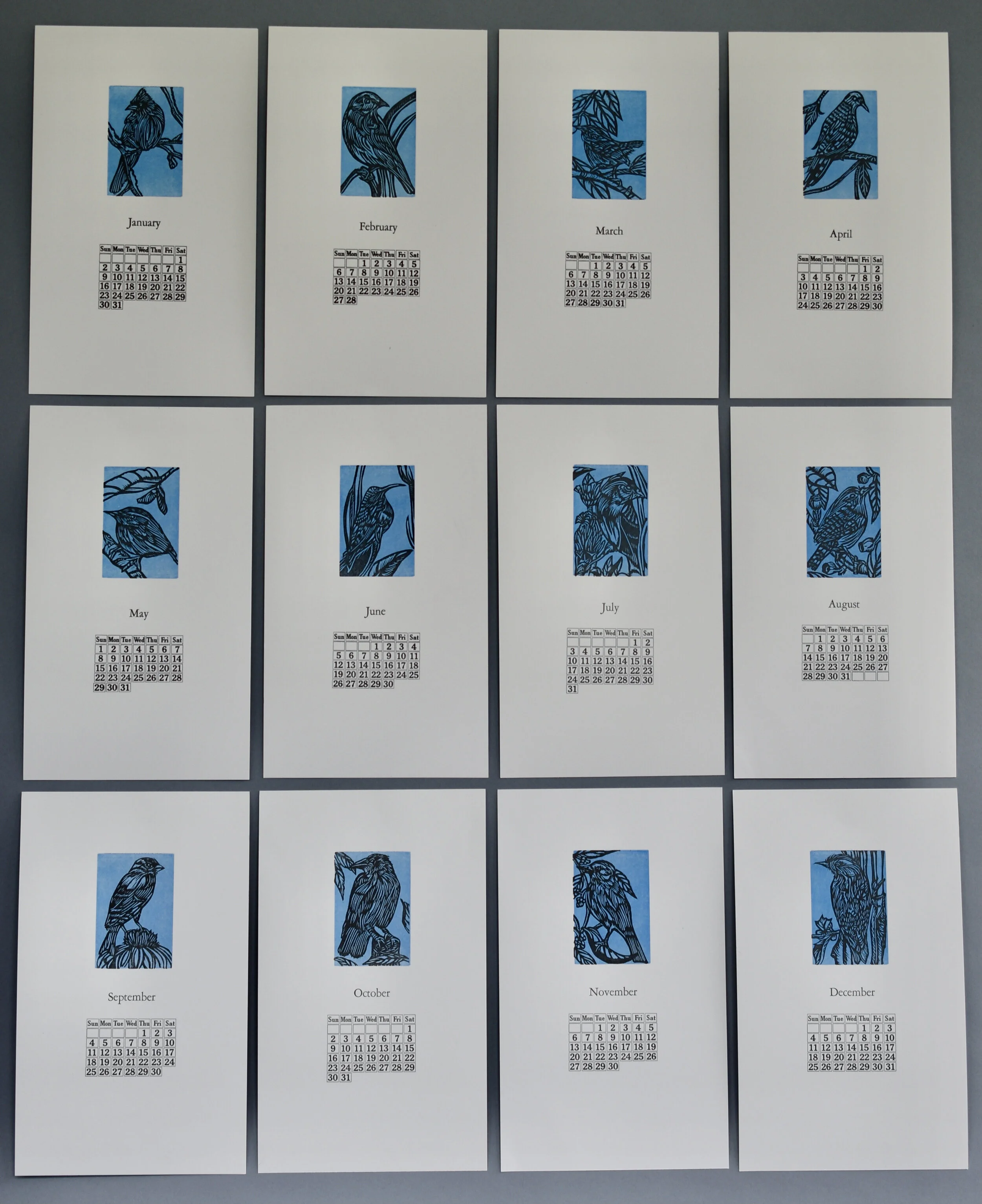
Backyard Birds - A Calendar for 2022

I designed and printed a calendar for 2022. The imagery is based on the numerous birds that frequent our backyard. In most respects the various steps I followed to complete this project were not as difficult as I’d anticipated. Here is brief overview of designing and printing the Backyard Birds 2022 Calendar.

I began by sketching and then carving numerous 3”x2” blocks. Here is a sampling of the sketched and transferred birds.

I began by sketching and then carving numerous 3”x2” blocks. Here is a sampling of the sketched and transferred birds.

Carved blocks and other items used to print the calendar.

Carved blocks and other items used to print the calendar.

Stacked and cut Cougar Natural paper, cover weight. I printed an edition of 42 calendars using approximately 475 cut sheets of paper  (12 birds and a cover sheet) measuring 11”x6” each.

Stacked and cut Cougar Natural paper, cover weight. I printed an edition of 42 calendars using approximately 475 cut sheets of paper (12 birds and a cover sheet) measuring 11”x6” each.

6FAE78F3-1E81-4F71-9E53-853737EB87E7_1_201_a.jpeg
359D5824-0B87-445C-B3D8-8C359EE2F07C_1_201_a.jpeg
A little wren adorns the cover. I used wood type and Garamond for the cover’s text.

A little wren adorns the cover. I used wood type and Garamond for the cover’s text.

All twelve months are completed, trimmed, and ready for packaging.

All twelve months are completed, trimmed, and ready for packaging.

Carving the Goldfinch.

Carving the Goldfinch.

Close up of some of the carved blocks.

Close up of some of the carved blocks.

A bird for each month was printed on a blue mat.

A bird for each month was printed on a blue mat.

After printing all of the birds I printed the month (using 24 pt Garamond) and dates using a Perpetual Calendar form purchased from Skyline Type Foundry. The perpetual form worked and printed beautifully. I printed the relief carved bird blocks separately from the metai type forms. Late in the printing process I discovered that I could have printed all of these at the same time. Oh well, live and learn!

After printing all of the birds I printed the month (using 24 pt Garamond) and dates using a Perpetual Calendar form purchased from Skyline Type Foundry. The perpetual form worked and printed beautifully. I printed the relief carved bird blocks separately from the metai type forms. Late in the printing process I discovered that I could have printed all of these at the same time. Oh well, live and learn!

I printed the colophon using 12 pt Garamond on the back of the last month - December.

I printed the colophon using 12 pt Garamond on the back of the last month - December.

8C41C4AC-FF27-490D-BC74-EE1B9193E471.jpeg
Packaged and ready for sales! I did not want to punch holes into the finished printed pages. Customers who purchase the calendars may want to frame some of their favorite months. I chose the paper clip as a way to present and hold the pages, after careful consideration. It won’t damage the print and works well as a hanging device.

Packaged and ready for sales! I did not want to punch holes into the finished printed pages. Customers who purchase the calendars may want to frame some of their favorite months. I chose the paper clip as a way to present and hold the pages, after careful consideration. It won’t damage the print and works well as a hanging device.

This was a great project for designing, printing, and learning! Upon completion I was reminded of a quote by Ralph Waldo Emerson. “The reward of a thing well done is to have done it.” Indeed!

An Assortment of Long Stitch Books

Text blocks using Mohawk Superfine paper, various end pages (some are pressure prints printed on my Vandercook), and tools. I prepared materials for eight books, which took the better part of a day.

Text blocks using Mohawk Superfine paper, various end pages (some are pressure prints printed on my Vandercook), and tools. I prepared materials for eight books, which took the better part of a day.

Materials for a second book.

Materials for a second book.

Using an awl to punch the sewing stations into the sections. The patterned strip of paper determines where the stations go in each of the nine sections.

Using an awl to punch the sewing stations into the sections. The patterned strip of paper determines where the stations go in each of the nine sections.

Spines of completed books.

Spines of completed books.

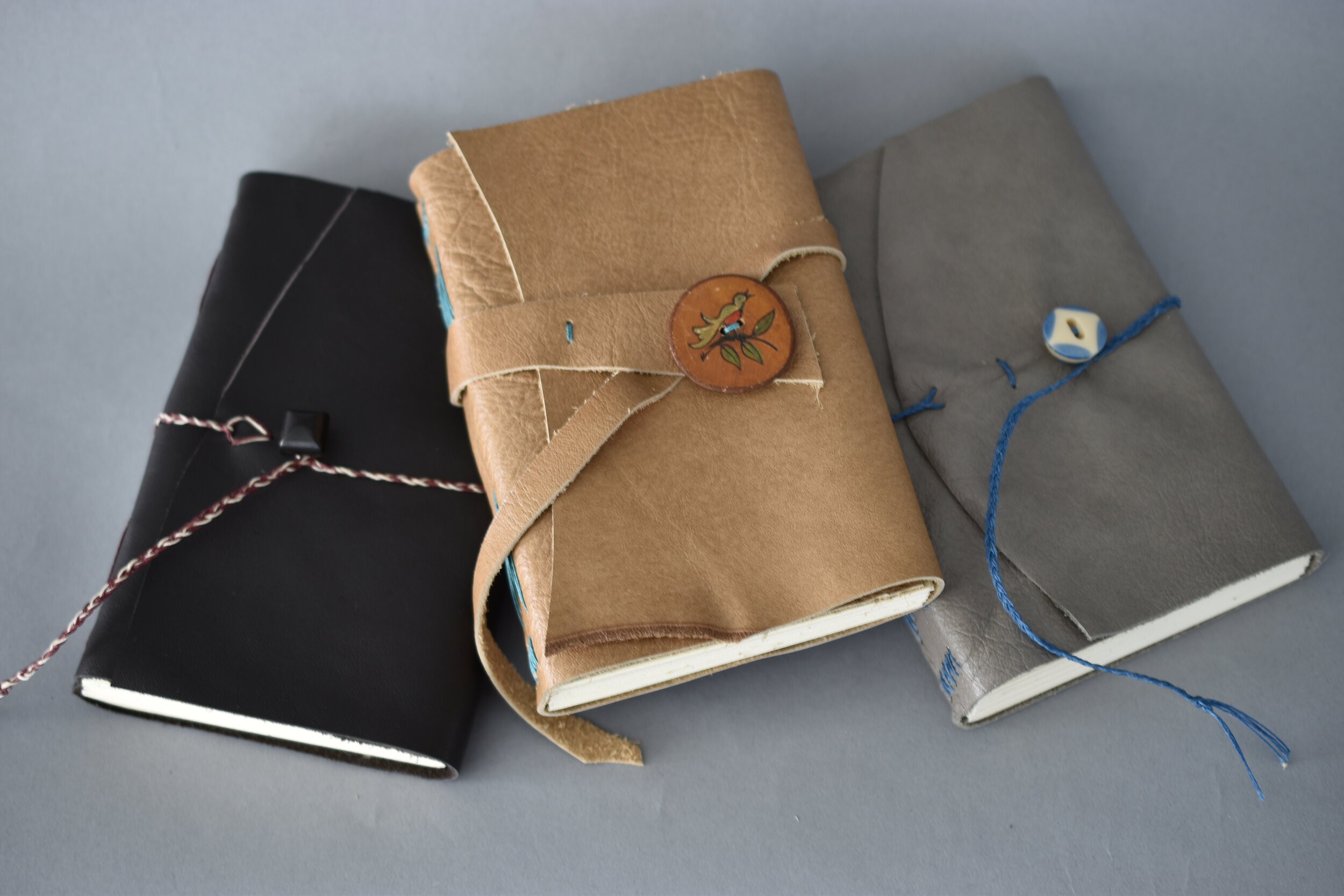
I took a break from printing to sew up several Long Stitch books. It is always enjoyable to bring together the various materials used in binding books and to consider design elements such as color and texture. Binding non-adhesive books allows me to use a variety of materials such as leather, cloth, paper, linen thread, and found objects; as well as my sewing skills.

The materials for this book included leather, pressure printed end pages, navy waxed linen thread, and a vintage button. Note the sewing stations on the book’s spine made by using my Japanese drill punch.

The materials for this book included leather, pressure printed end pages, navy waxed linen thread, and a vintage button. Note the sewing stations on the book’s spine made by using my Japanese drill punch.

Materials for a third book. I used a beautiful Mother Pearl vintage button for the closure.

Materials for a third book. I used a beautiful Mother Pearl vintage button for the closure.

Sewing up the book, bringing all of the components together!

Sewing up the book, bringing all of the components together!

Covers

Covers

Ode to Spring - a reduction print and a book!

I began with a pencil drawing inspired by several photographs of our gardens. I also planned this print based on using it to produce an accordion fold book. Therefore, I chose a horizontal orientation for the image with a size of 6”x9”.

I began with a pencil drawing inspired by several photographs of our gardens. I also planned this print based on using it to produce an accordion fold book. Therefore, I chose a horizontal orientation for the image with a size of 6”x9”.

I also prepared a pressure plate of leaves. I printed this on the reverse side of the prints I completed for the book.

I also prepared a pressure plate of leaves. I printed this on the reverse side of the prints I completed for the book.

Here is a later color run through the press. Note how the image is beginning to develop as I carve more of the image and layer the colors. Registration is imperative in reduction prints. It is exciting to use this process which takes patience and pl…

Here is a later color run through the press. Note how the image is beginning to develop as I carve more of the image and layer the colors. Registration is imperative in reduction prints. It is exciting to use this process which takes patience and planning.

The final color for the key block was a dark teal green.

The final color for the key block was a dark teal green.

It was a relief to see and experience  how the handmade paper worked for the folded book. It did take a number of days to dry because of the sizing in the paper and the layers of ink. Still, once it was dry all of my planning paid off. Note the spac…

It was a relief to see and experience how the handmade paper worked for the folded book. It did take a number of days to dry because of the sizing in the paper and the layers of ink. Still, once it was dry all of my planning paid off. Note the spaces on either size of the printed image. I included these to allow for text.

I covered the cover boards with Ingres paper after carving a recessed area on the front cover. I added a cut out image from a print to this space. Yes, I sacrificed a print for this!

I covered the cover boards with Ingres paper after carving a recessed area on the front cover. I added a cut out image from a print to this space. Yes, I sacrificed a print for this!

I made a ‘belly wrap’ for each book.

I made a ‘belly wrap’ for each book.

Front of  ‘Ode to Spring’. Note how the text fits beautifully into the side spaces.

Front of ‘Ode to Spring’. Note how the text fits beautifully into the side spaces.

I sent one of the completed books to the Illustrated Accordion artist book exhibition at the Kalamazoo Book Arts Center in Kalamazoo, MI. It is a wonderful opportunity to exhibit my work and see the other beautiful books via the virtual online exhib…

I sent one of the completed books to the Illustrated Accordion artist book exhibition at the Kalamazoo Book Arts Center in Kalamazoo, MI. It is a wonderful opportunity to exhibit my work and see the other beautiful books via the virtual online exhibit!

Gardening is an activity that brings me great joy (and sometimes a bit of frustration). Spring is always exciting in my gardens. Consequently, I decided to create a print honoring this season rich with colors, shapes, and textures. I completed a reduction print focusing on the many flowers and creatures that appear and inspire after the cold, dark days of winter.

I transferred the drawing to the linoleum block, Next, I outlined the image with a Sharpie pen and began the carving and printing process. Here, I have carved all the areas that will remain white. I printed on two types of paper. One was handmade co…

I transferred the drawing to the linoleum block, Next, I outlined the image with a Sharpie pen and began the carving and printing process. Here, I have carved all the areas that will remain white. I printed on two types of paper. One was handmade cotton rag paper I had made several years ago which I used for the book. l printed a small edition of the print on Cougar Natural.

I printed a total of seven colors for the print.. Here is the second color run, a light chartreuse green.

I printed a total of seven colors for the print.. Here is the second color run, a light chartreuse green.

I was ready for the final run using the key block after six color runs through the press. I was pleased with the quality of carving I did to complete this key block!

I was ready for the final run using the key block after six color runs through the press. I was pleased with the quality of carving I did to complete this key block!

I titled the print ‘Ode to Spring’. The Cougar Natural paper is a wonderful paper for reduction prints. The colors really pop!

I titled the print ‘Ode to Spring’. The Cougar Natural paper is a wonderful paper for reduction prints. The colors really pop!

I used Twentieth Century metal type for the text - the title of the book and the colophon. I printed these on separate sheets of paper. I did not want to chance losing a print. Therefore, I added the printed information to the folded book pages usin…

I used Twentieth Century metal type for the text - the title of the book and the colophon. I printed these on separate sheets of paper. I did not want to chance losing a print. Therefore, I added the printed information to the folded book pages using PVA.

Folding the interior book page.

Folding the interior book page.

The completed edition of three books!

The completed edition of three books!

This image shows the back of the book, as well as the front cover. I was really pleased with how the pressure print interacted with the reduction print on the reverse side of the book. Additionally, the embellished recessed area on the front cover p…

This image shows the back of the book, as well as the front cover. I was really pleased with how the pressure print interacted with the reduction print on the reverse side of the book. Additionally, the embellished recessed area on the front cover provides a nice element to the book’s cover.

Botanicals - Reduction Relief Prints

Pencil sketches of the flowers.

Pencil sketches of the flowers.

I go over each transferred image with a Sharpie pen; facilitating the carving process.

I go over each transferred image with a Sharpie pen; facilitating the carving process.

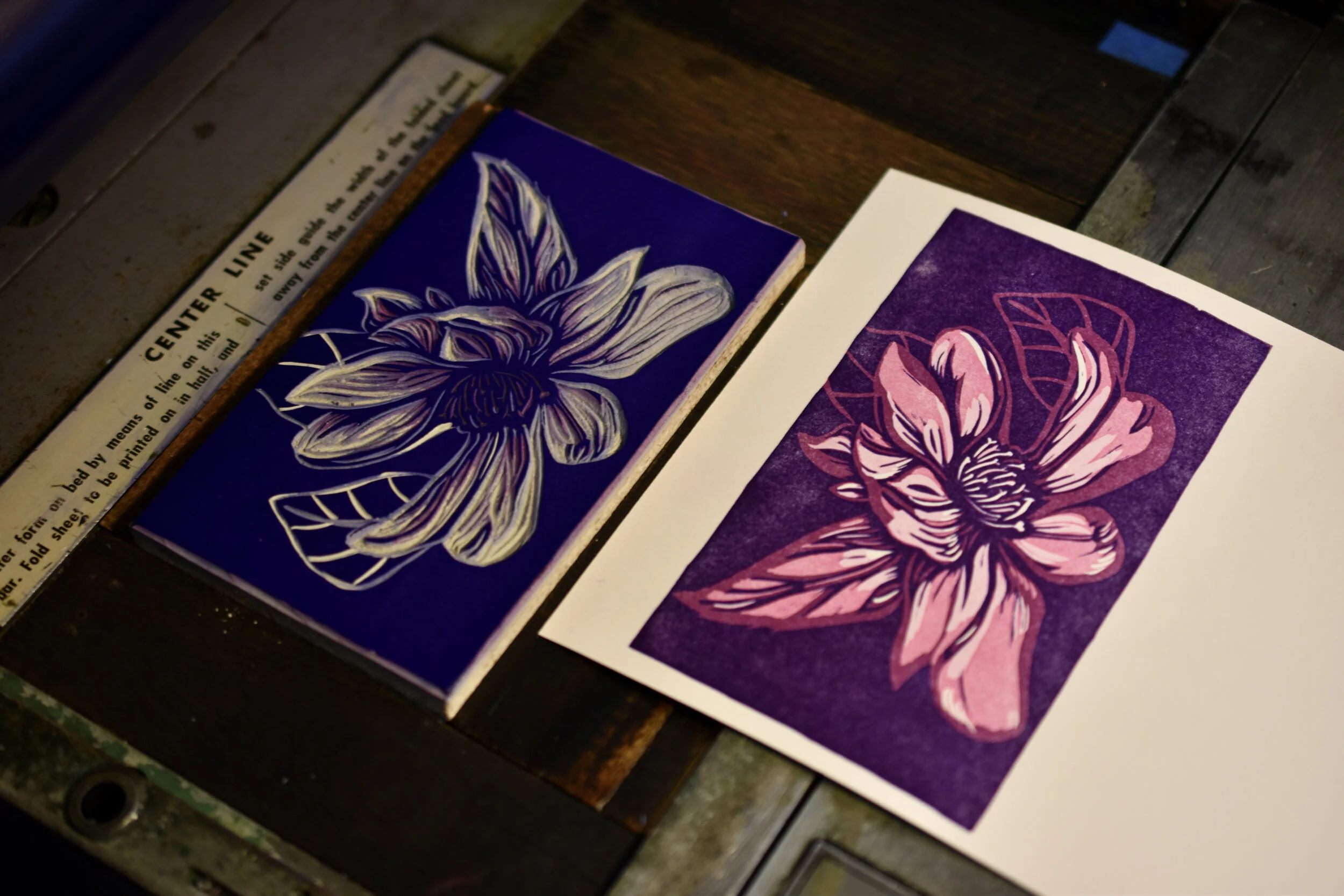
I printed each card in a pale pink color after carving what remained white.
I printed each card in a pale pink color after carving what remained white.

More was carved away on each block. This caused the areas of the darker pink to remain on the flower images. I then printed a dark blue purple color on each flower. This also provided the dark background for each print.

More was carved away on each block. This caused the areas of the darker pink to remain on the flower images. I then printed a dark blue purple color on each flower. This also provided the dark background for each print.

Detail of one of the cards. A great deal of work and planning was involved in printing this suite of flowers. Still, it was worth the time and effort.

Detail of one of the cards. A great deal of work and planning was involved in printing this suite of flowers. Still, it was worth the time and effort.

I love flowers any time of the year. Those that survive the cold nights of winter to provide beauty and color are some of my favorites! I completed a group of cards in honor of these wonders.

I took photographs of four flowers; two Lenten roses, a Pansy, and a Camellia. I then moved on to sketching, transferring, carving and printing each flower. I used the reduction relief printing process.

Each image has been transferred to a linoleum block.

Each image has been transferred to a linoleum block.

I then carved the areas on each flower that remained the pale pink hue. The  second color run was a darker pink, almost magenta (Rubine red was the main ink in this mixed hue).

I then carved the areas on each flower that remained the pale pink hue. The second color run was a darker pink, almost magenta (Rubine red was the main ink in this mixed hue).

Here are the four completed botanical images. Can you guess which are the Lenten roses, Camellia, and Pansy?

Here are the four completed botanical images. Can you guess which are the Lenten roses, Camellia, and Pansy?

The Sentinel and the Nurturer - Two Prints

The crows are sketched and ready to transfer to a linoleum block for carving.

The crows are sketched and ready to transfer to a linoleum block for carving.

Both drawings have been transferred to linoleum blocks. I then went over the image with a Sharpie pen. This step facilitates the carving process because it helps clarify what to carve away and what to leave.

Both drawings have been transferred to linoleum blocks. I then went over the image with a Sharpie pen. This step facilitates the carving process because it helps clarify what to carve away and what to leave.

I printed a blue mat to serve as a background for each print.

I printed a blue mat to serve as a background for each print.

B320FBA6-4856-45B4-AD49-C304A24E8817_1_201_a.jpeg
Completed print titled ‘Nurturer’.

Completed print titled ‘Nurturer’.

I was so pleased with these images and grateful to have this paper which provided such a richly textured printing surface!

I completed two prints in late September, 2020. They were for the Winter Show at the GreenHill Center for NC Art. Here is a look at the drawing, carving, and printing processes for these two bird prints; tributes to two of my favorite birds!

The wren and nest are ready to transfer to a block for carving.

The wren and nest are ready to transfer to a block for carving.

This image is carved and ready to proof and print!

This image is carved and ready to proof and print!

The wren and nest are carved and ready to print.

The wren and nest are carved and ready to print.

I printed on a Kozo paper I had made many years ago. I found it in my flat files while cleaning out my studio (a fulfilling task during the pandemic). This paper provided a beautiful surface for printing.

I printed on a Kozo paper I had made many years ago. I found it in my flat files while cleaning out my studio (a fulfilling task during the pandemic). This paper provided a beautiful surface for printing.

I am appreciative of the wisdom of crows and how they look out for one another. I titled this print ‘Sentinel’.

I am appreciative of the wisdom of crows and how they look out for one another. I titled this print ‘Sentinel’.